
Razzo
WordPress landing page | Figma-based implementation
- Platform
- WordPress
- Period
- Mar 2025
- Stack
- WordPress
- CSS
- JavaScript
Overview
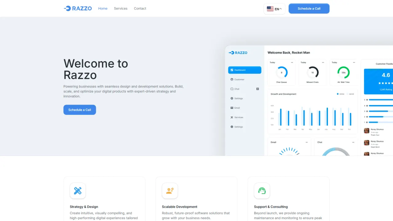
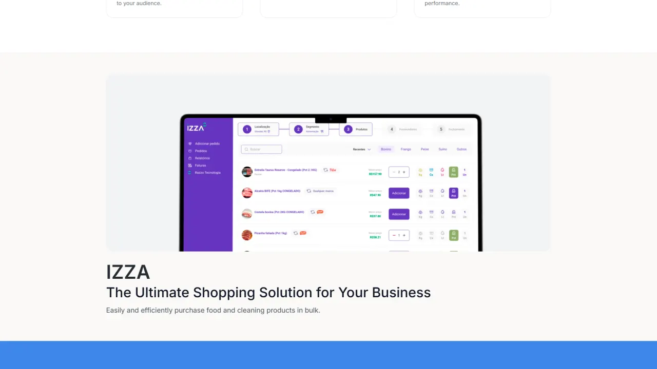
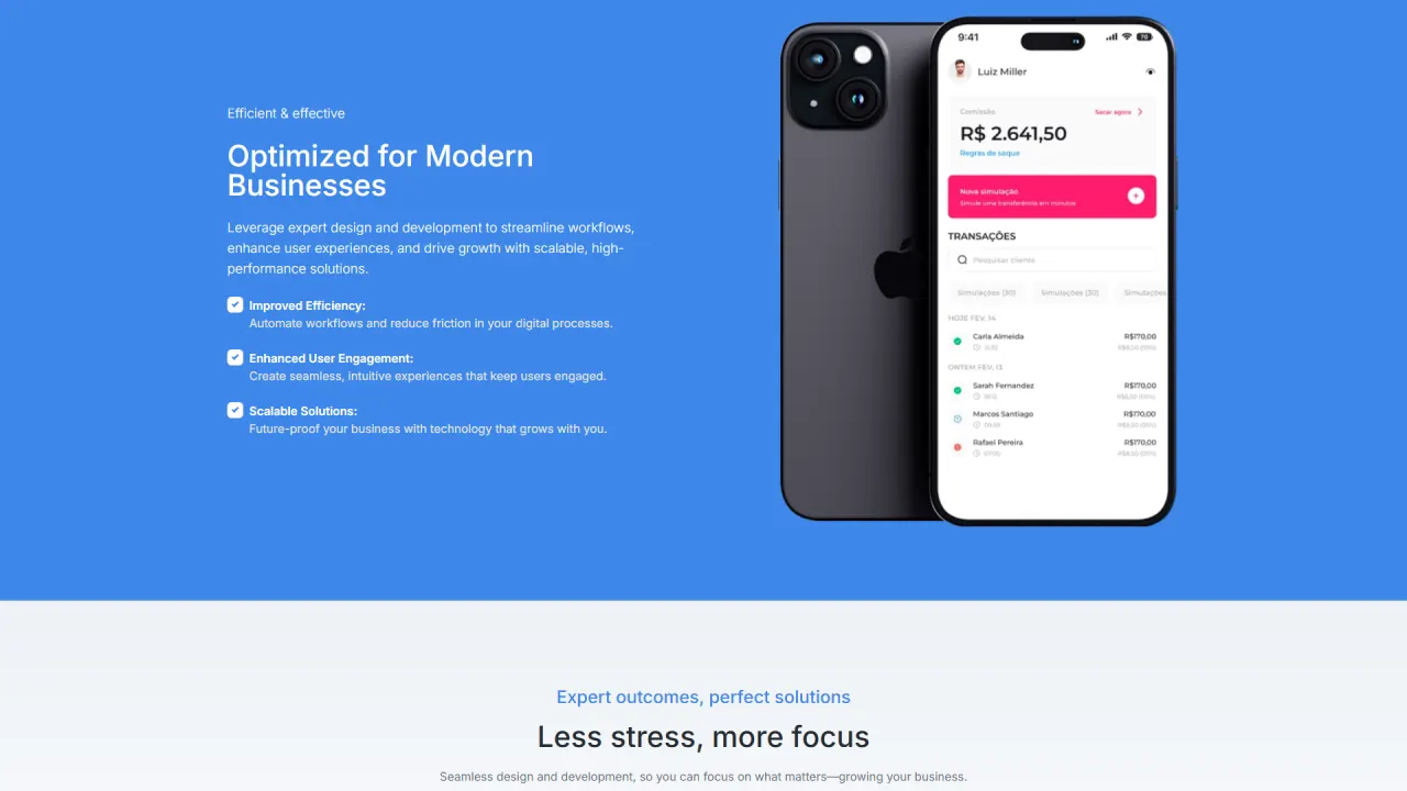
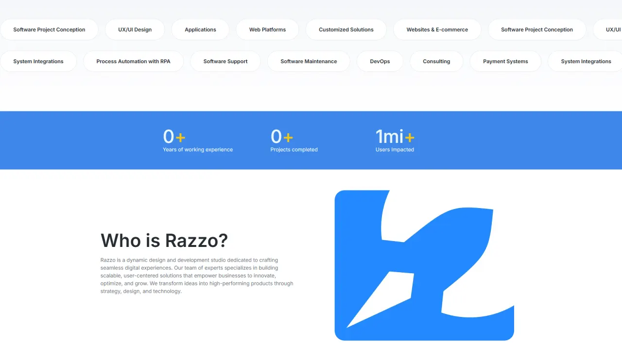
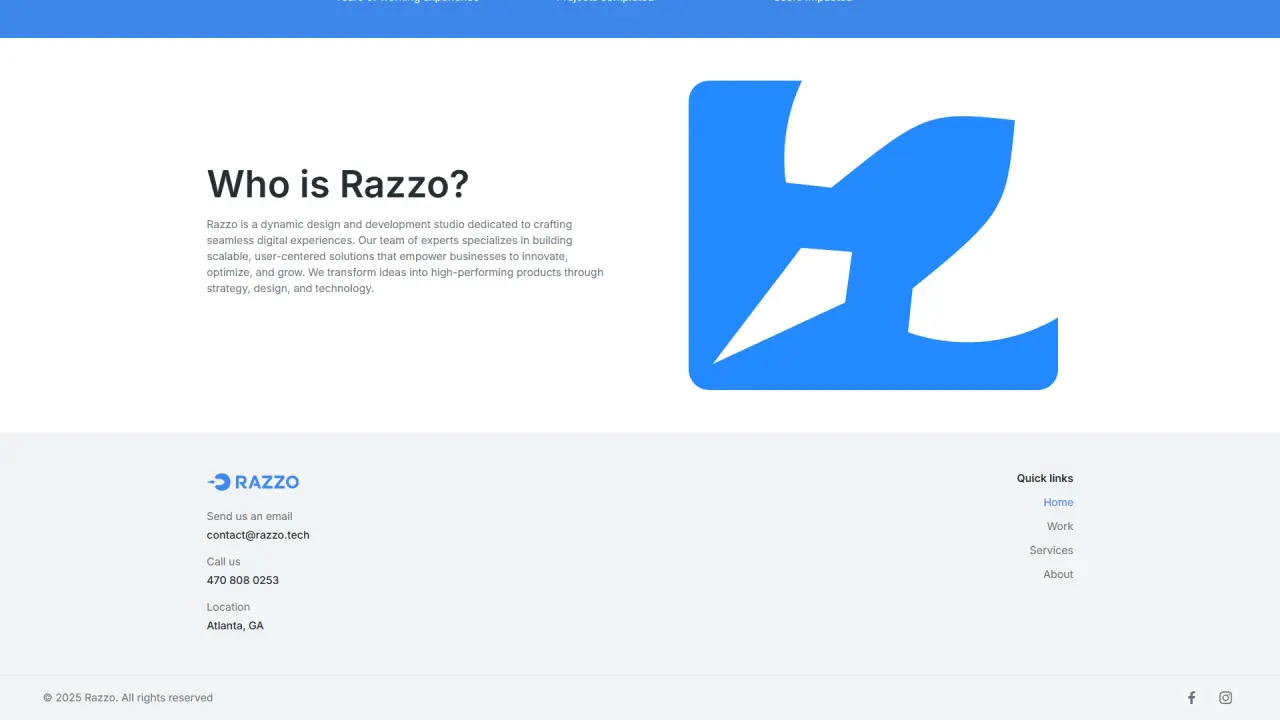
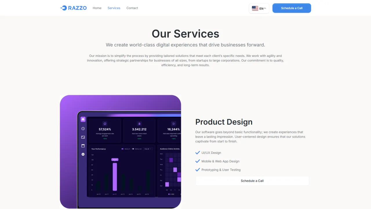
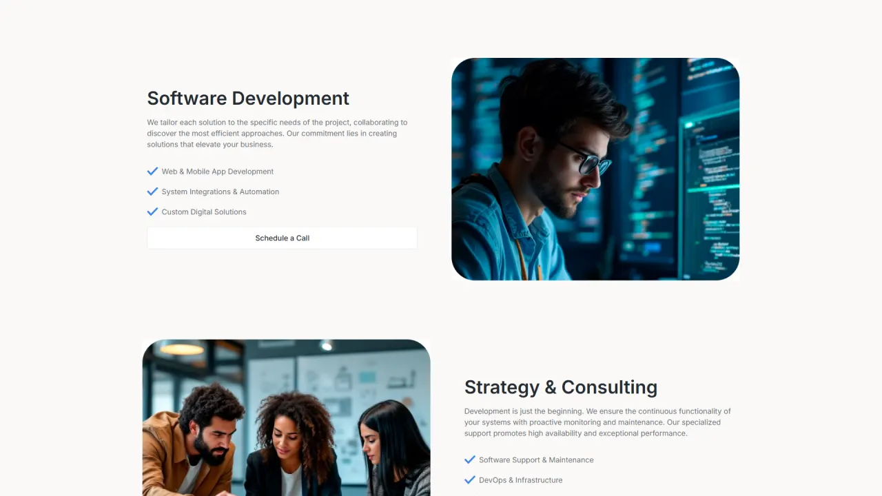
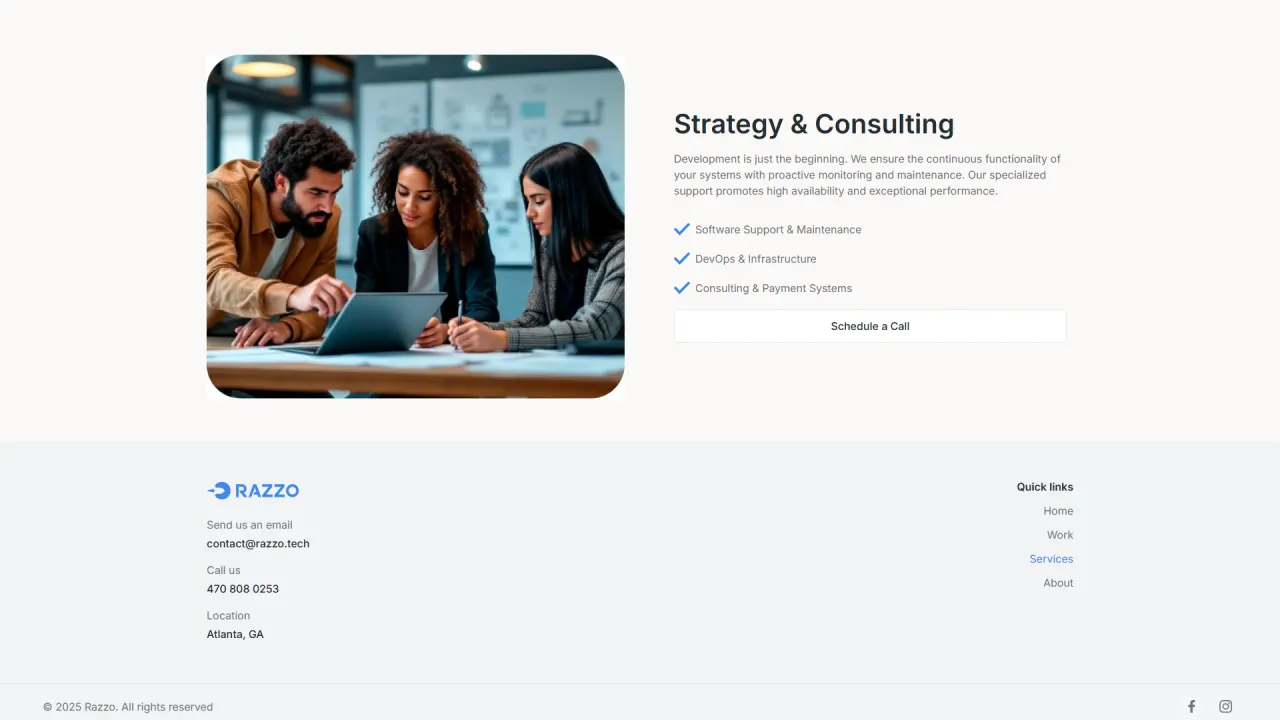
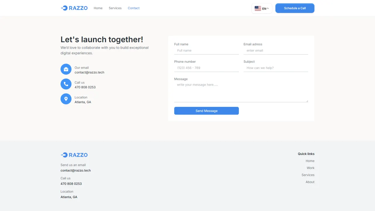
Razzo was a WordPress landing page built from a layout previously provided by the client in Figma. The main focus was turning the design into a real page with high visual fidelity, delivering a modern, smooth, responsive experience.
Context and objective
When a client already has a ready layout, the value is in precise execution. The objective was to preserve the original design fidelity and apply final adjustments to fully meet expectations, ensuring visual consistency, strong readability, and simple navigation across three main sections: Home, Services, and Contact.
The challenge
The main challenge was achieving high visual fidelity without relying on heavy custom coding. It was necessary to fine-tune spacing, typography, rounded corners, and animations to match the Figma standard, ensuring the final result feels refined rather than simply assembled. In addition, the page needed to be accessible to different audiences, which required integrating a translation solution.
The strategy
The strategy was to implement the layout in WordPress with a focus on consistency and polish, building section by section and validating each fold against the original design. Visual elements such as rounded corners and animations were applied with control to add dynamism without compromising readability. In parallel, a translation feature was included to expand accessibility and support a more diverse audience.
What was implemented
High-fidelity Figma implementation:
- Section-based structure: landing page built across Home, Services, and Contact, keeping navigation simple and direct.
- Visual fidelity: fine adjustments to spacing, typography, and hierarchy to match the provided layout as closely as possible.
- Modern finish: rounded corners and refined visual details applied for a contemporary look.
Dynamism and responsiveness:
- Animated elements: subtle animations to make the experience more dynamic and pleasant.
- Responsive design: desktop and mobile adaptation ensuring consistent readability and navigation.
Accessibility and reach:
- Translation plugin: integration of a translation feature to expand accessibility and support a diverse audience.
Result
The result was a modern, responsive landing page visually consistent with the Figma design, with details that reinforce the Razzo identity and improve user experience. The project shows how the combination of thoughtful design and precise implementation can deliver a functional and visually strong outcome, focused on clarity, dynamism, and accessibility.