
Capriccio
Tray e-commerce | Visual direction + theme configuration | Food and seasonings
- Platform
- Tray
- Period
- Dec 2025
- Stack
- Tray
- Photoshop
- Illustrator
Overview
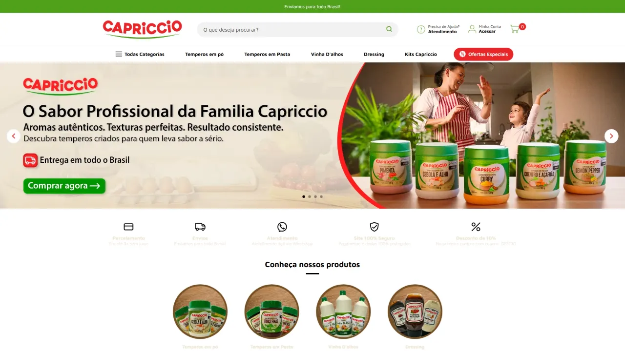
Capriccio already had strong presence in physical retail, appearing on shelves in supermarkets and local grocery stores, but needed to translate that authority into a digital experience that truly drives purchase intent. The project focused on building a strong online storefront with consistent identity and professional visual communication to accelerate the brand’s entry into e-commerce.
Context and objective
The challenge here was not simply “being online”, but looking established from the very first visit. The store had to communicate product-line variety, build trust, highlight bundles and weekly deals, and at the same time convey the feeling of a real brand present in everyday life, just as it already was at the physical point of sale.
The challenge
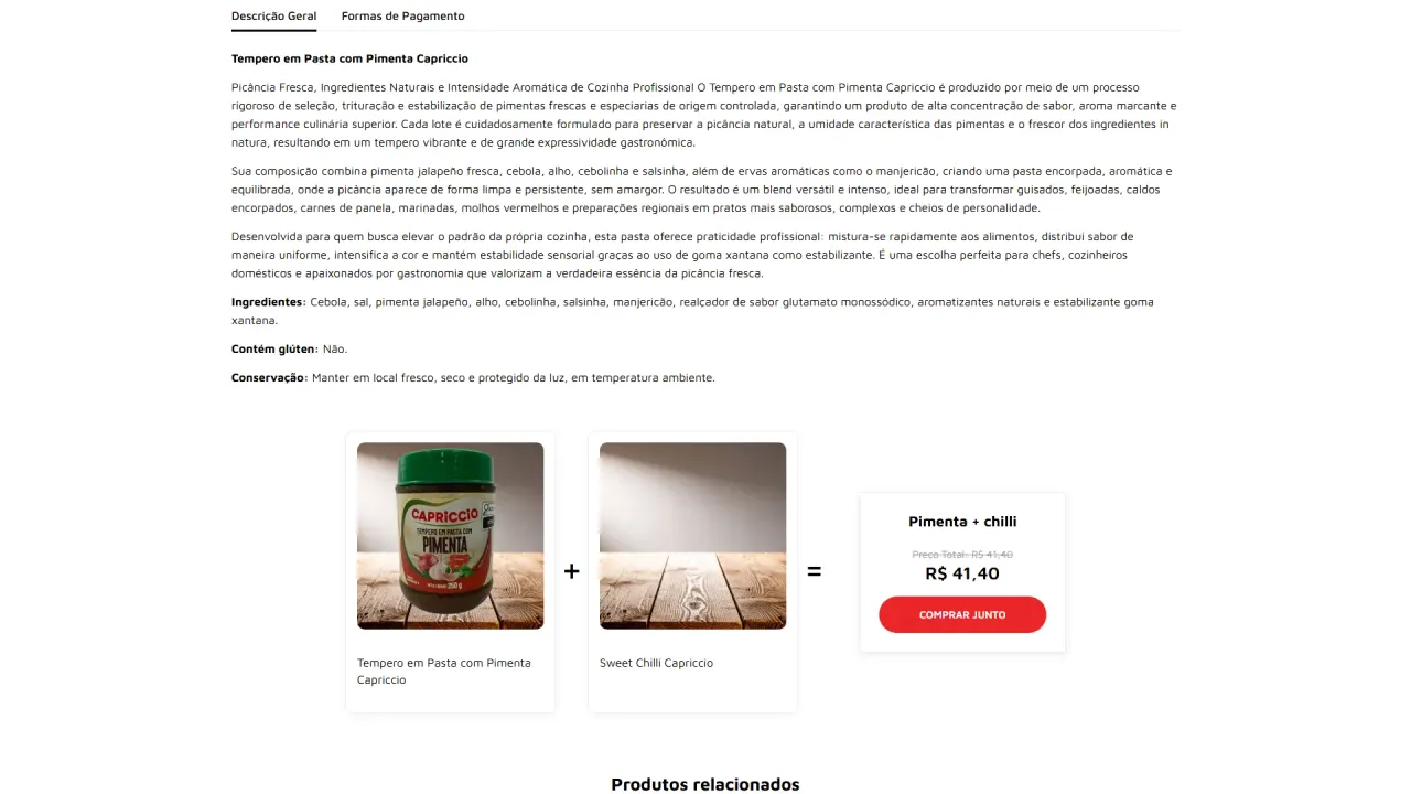
The greatest responsibility of this project was the visual layer, because in food e-commerce purchase decisions are heavily influenced by imagery, composition, and fast readability of benefits. We needed to create a complete ecosystem of assets, ensuring unity across banners, icons, product grids, and sections without making the site look like a generic template. In addition, part of the imagery needed quality upgrades to keep a premium standard across the entire layout.
The strategy
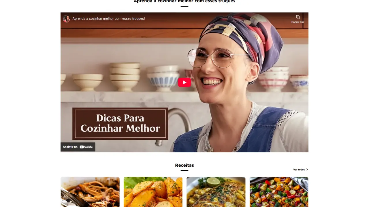
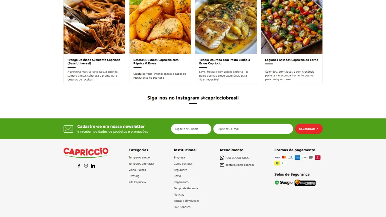
Turn the homepage into a premium supermarket-style storefront with clear, repeatable communication. The approach was to organize the journey into scan-friendly blocks, reinforcing product lines, weekly offers, bundles, and recommendation sections, always with visual consistency. The goal was to guide the user with clarity and create a strong visual rhythm, reducing noise and increasing trust.
What was implemented
Visual direction and static content:
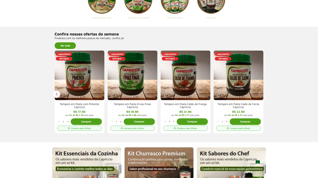
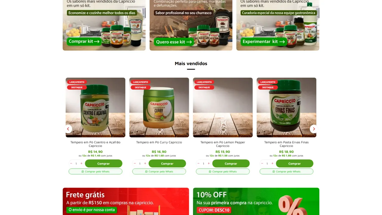
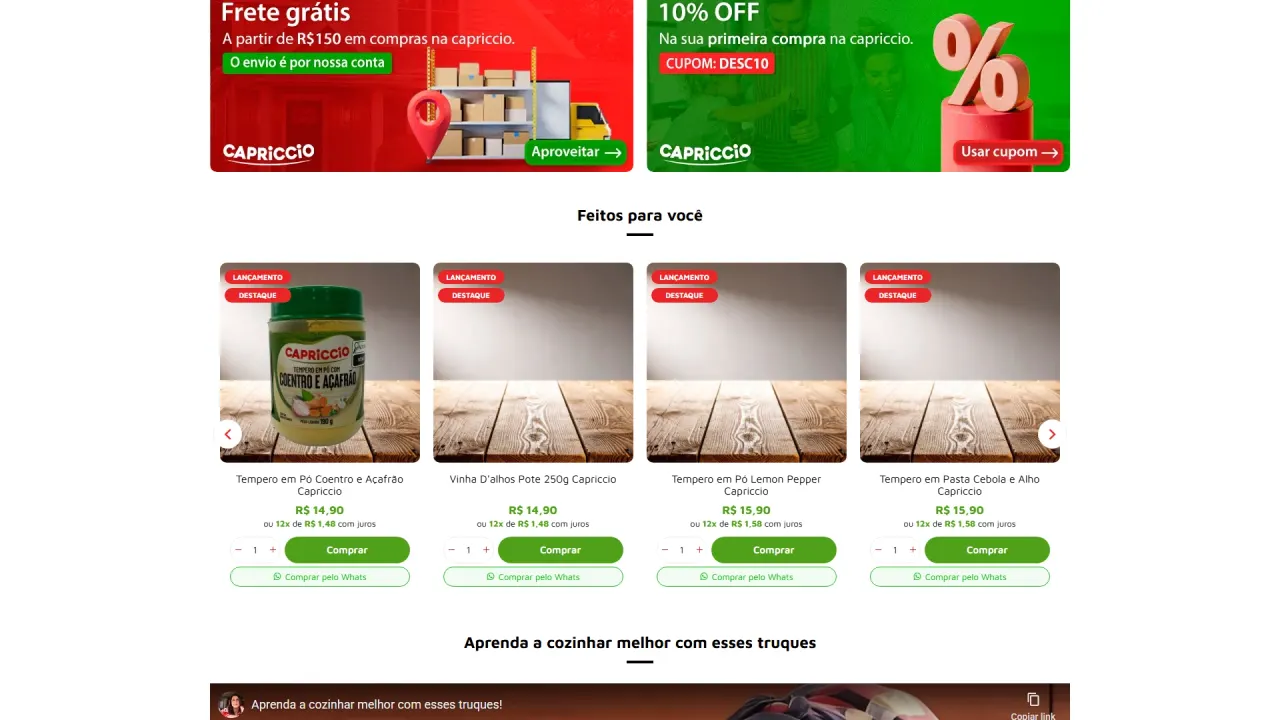
- Banners and campaigns: creation of hero banners, category banners, bundle cards, and highlight assets for deals and benefits.
- Icons and theme elements: development of icons and static images to reinforce credibility, key advantages, and quick scanning.
- Banner humanization: use of premium stock imagery to bring real-life context of kitchen, family, and everyday routines, elevating brand perception.
Image quality and refinement:
- Upscale and visual enhancement: using Gemini Pro with Nano Banana to improve quality and finishing of specific images, maintaining consistency in sharpness and lighting.
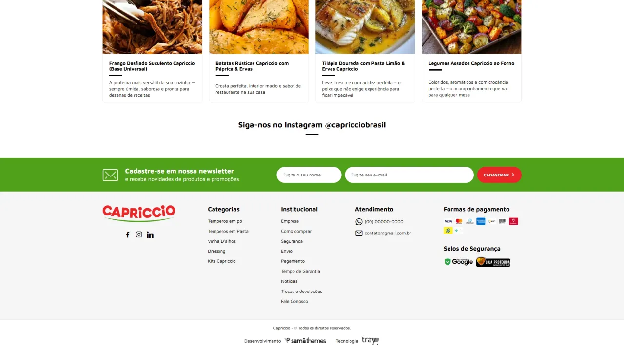
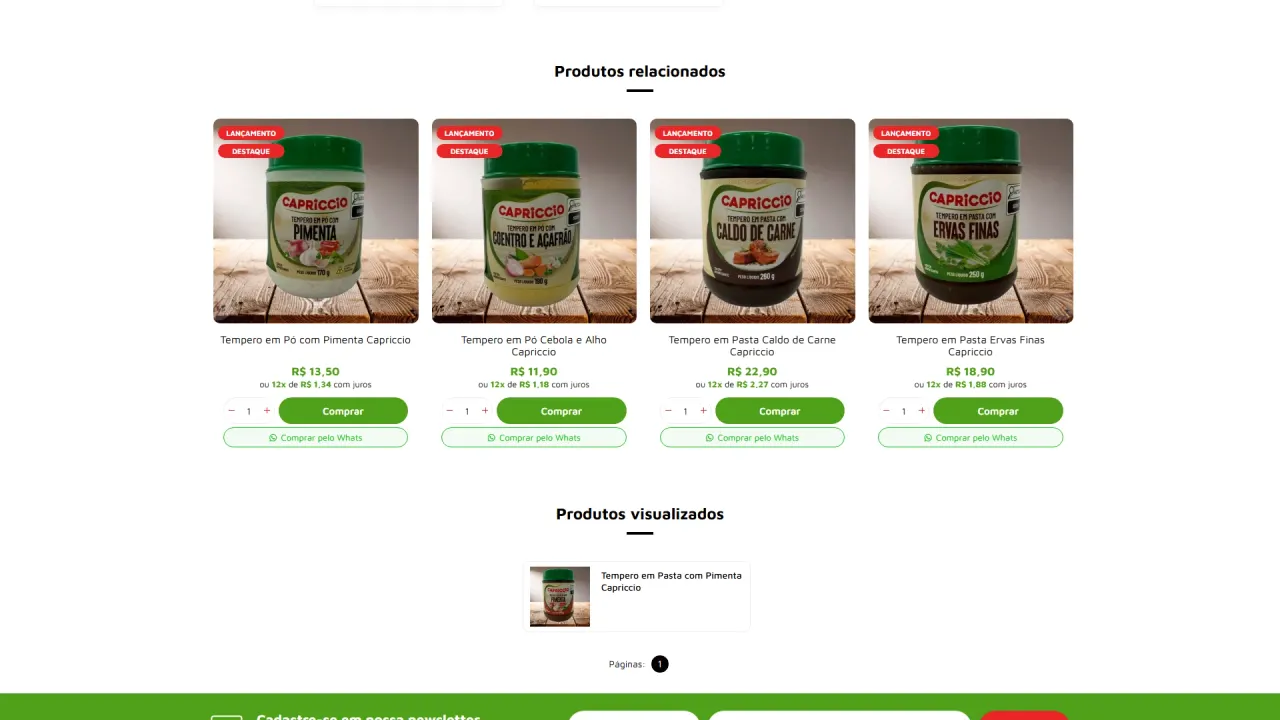
- Catalog standardization: careful attention to cropping, proportions, and coherence across images so grids, bundles, and sections do not compete visually.
Theme configuration and structure:
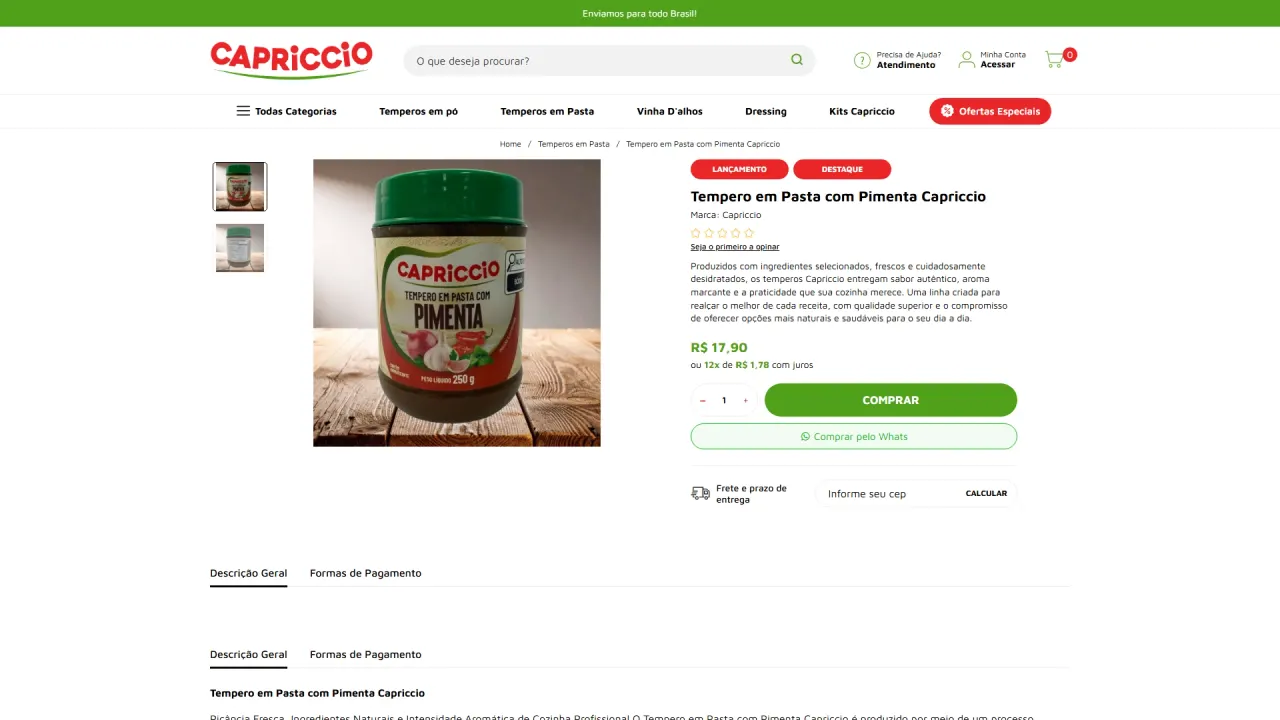
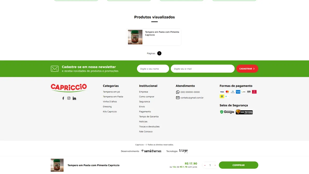
- Layout and hierarchy: color configuration, section positioning, product-grid organization, and content insertion in strategic areas.
- Responsiveness: content adjustments to maintain strong readability and impact on both desktop and mobile.
- Presentation best practices: structuring blocks such as weekly deals, best sellers, bundles, and supporting content to increase time on site and purchase intent.
Result
Capriccio gained a storefront with a strong, cohesive, commercial visual presence, looking professional from the very first fold. The project elevated the brand’s digital positioning with more human banners, well-organized product grids, and consistent visual identity, creating an environment ready to sell and compete with established e-commerce brands.