
Loja da RO
Personal project | Shopify + Liquid + HTML, CSS, JavaScript and JSON
- Platform
- Shopify
- Period
- Sep to Dec 2023
- Stack
- Shopify
- HTML
- CSS
- JavaScript
- JSON
- Photoshop
- Illustrator
Overview
Loja da RO was born as a personal project with a meaningful purpose: creating an online store as a tribute to my mother. More than a technical exercise, it was designed to translate emotion into visual identity, building a digital experience with presence, delicacy, and intention.
Context and objective
In March 2023, I started the development on Shopify with the goal of going beyond what free themes usually allow. Over three months, I deepened my knowledge of Liquid and the Shopify ecosystem structure, studying the documentation and applying HTML, CSS, JavaScript, and JSON to evolve the theme and customize the experience with more freedom.
The challenge
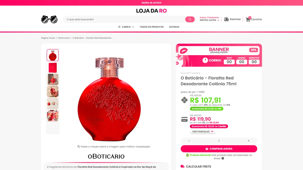
The main challenge was overcoming free-theme limitations without losing consistency and visual quality. It was necessary to redesign the interface for a female audience, keep navigation intuitive, and at the same time create custom components that elevate the user experience and reinforce brand identity with a professional finish.
The strategy
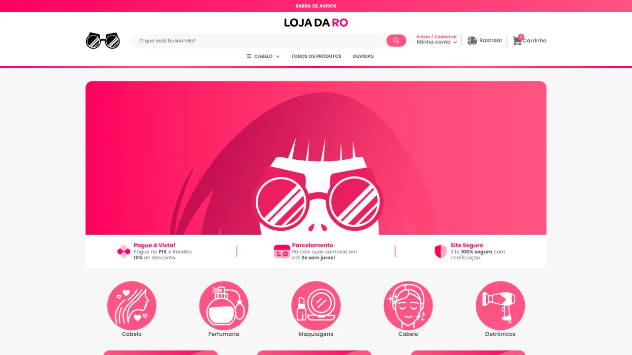
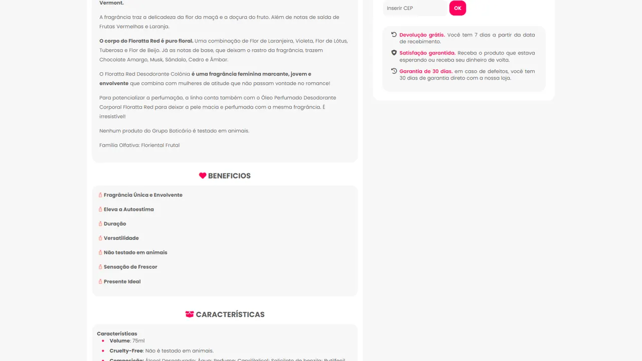
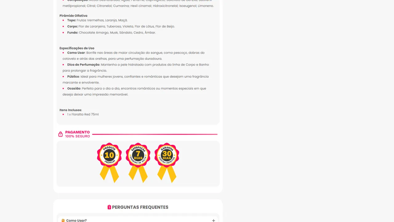
The strategy was to start from a standard Shopify theme and rebuild the experience through a full visual redesign, creating a modern and delicate visual system. The pink-toned palette, rounded corners, and soft elements were designed to strengthen emotional connection with the concept, while structural adjustments ensured clarity, usability, and visual rhythm throughout the navigation.
What was implemented
Visual redesign and identity:
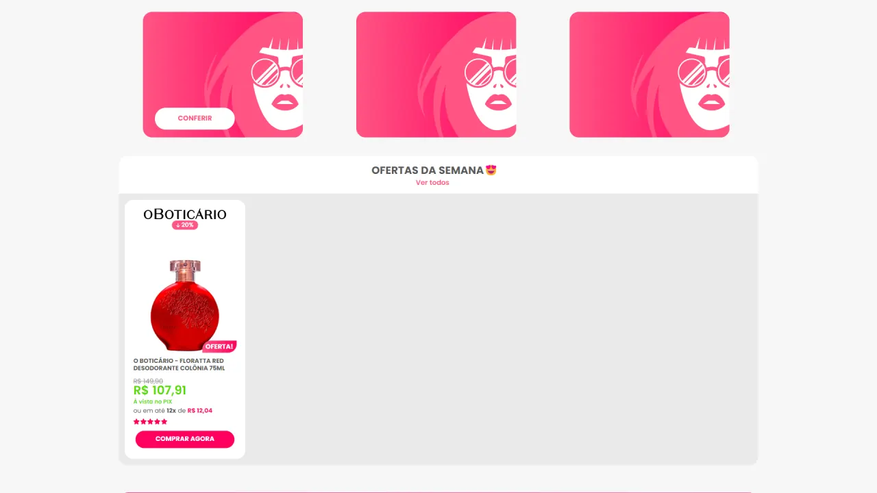
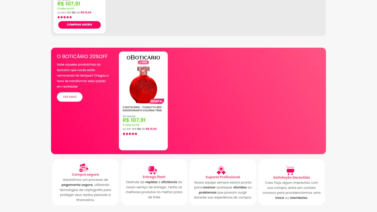
- Redesigned interface: rounded corners, soft graphic elements, and a lighter composition to reinforce a feminine and welcoming aesthetic.
- Pink color palette: selection and standardization of colors to strengthen brand presence and keep consistency across pages.
- Personal touches: vectors and visual choices designed to represent my mother’s unique characteristics within the store’s universe.
Technical customization in Shopify:
- Liquid as the customization foundation: study and practical application to adapt sections, components, and theme behavior.
- HTML and CSS: structural adjustments and visual refinement to elevate finishing and layout consistency.
- JavaScript and JSON: behaviors and configurations implemented to increase flexibility, improve experience, and overcome limitations of the base theme.
Components and user experience:
- Custom contact forms: contact flow built with its own structure and styling to improve usability.
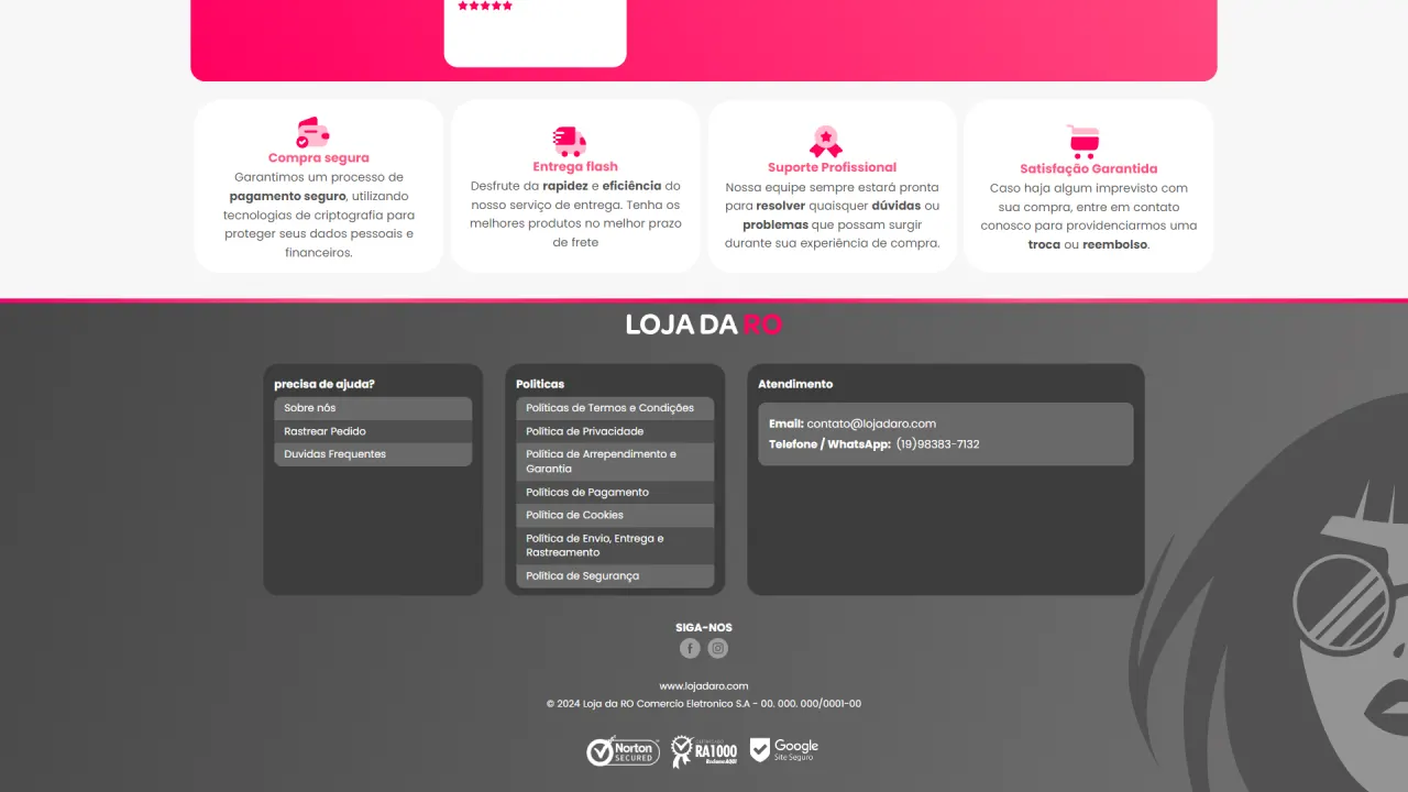
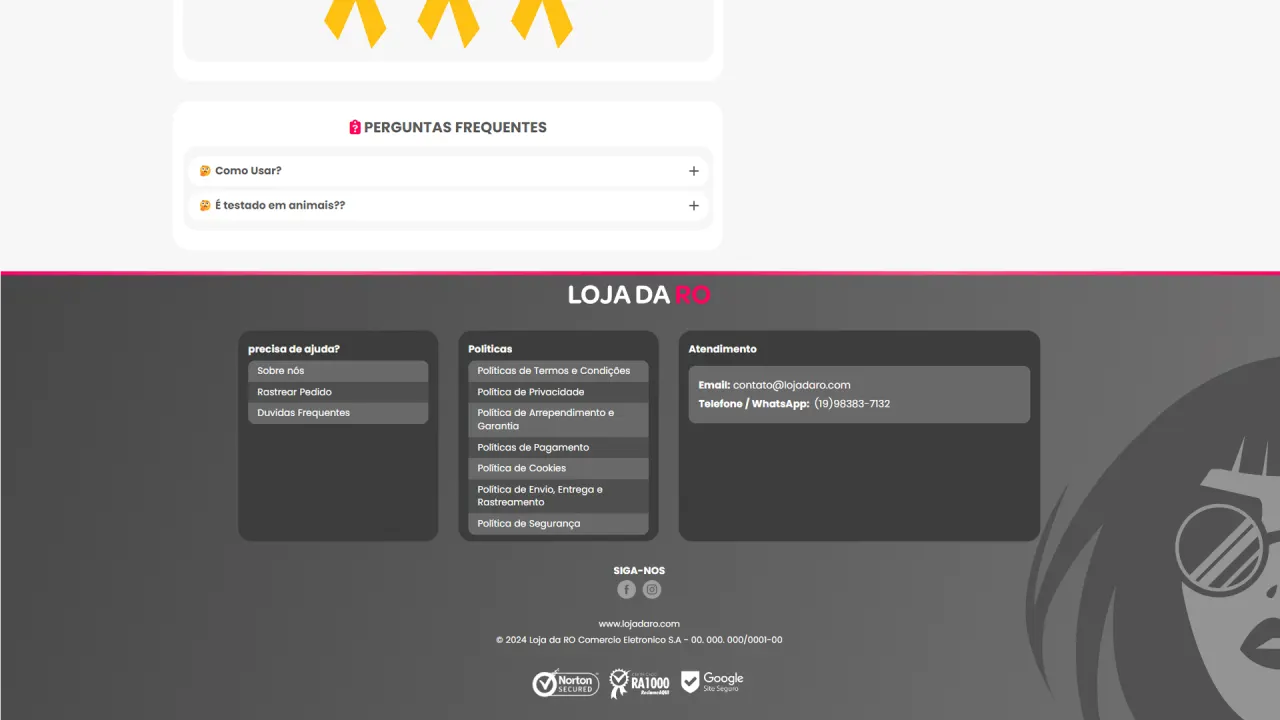
- Custom footer: tailored footer creation to organize information and improve end-of-journey navigation.
- UX consistency: careful attention to page flow and visual rhythm to keep the experience smooth and intuitive.
Result
The final result exceeded my personal expectations and officially marked the beginning of my career as a front-end developer. Beyond the visual delivery, the project consolidated practical mastery of Shopify and Liquid, strong redesign and theme customization skills, and technical execution with HTML, CSS, JavaScript, and JSON, all grounded in a personal concept with real meaning.