
Aurora Tecidos
Shopify engineering + UI system design | Proprietary ELOY V2 theme
- Platform
- Shopify
- Period
- Jan to Feb 2026
- Stack
- Shopify
- HTML
- CSS
- JavaScript
- JSON
- Node.js
Overview
Aurora Tecidos was not simply a redesign. It was a full reconstruction of the brand’s digital experience.
The project began with a strategic UI creation in Figma, a prototype developed in approximately 8 hours to quickly validate visual direction, hierarchy, and usability. The client was facing clear issues: cluttered layout, poor readability, and navigation friction.
The UI was designed as a system. The theme was engineered as infrastructure.
Context and objective
Aurora’s audience primarily values clarity and practicality. Small typography, excessive information, and competing visual elements were directly affecting the shopping experience.
The objective was to transform the store into a modern, clear, and highly functional environment for an audience that is not accustomed to complex interfaces.
The challenge
The challenge wasn’t simply to “make it look better.” It was to make the journey intuitive, predictable, and comfortable.
We needed to:
- Reduce visual noise
- Establish strong information hierarchy
- Improve readability
- Reinforce trust signals
- Maintain a frictionless purchase flow
The strategy
The strategy was to structure the store as a coherent visual system with replicable patterns.
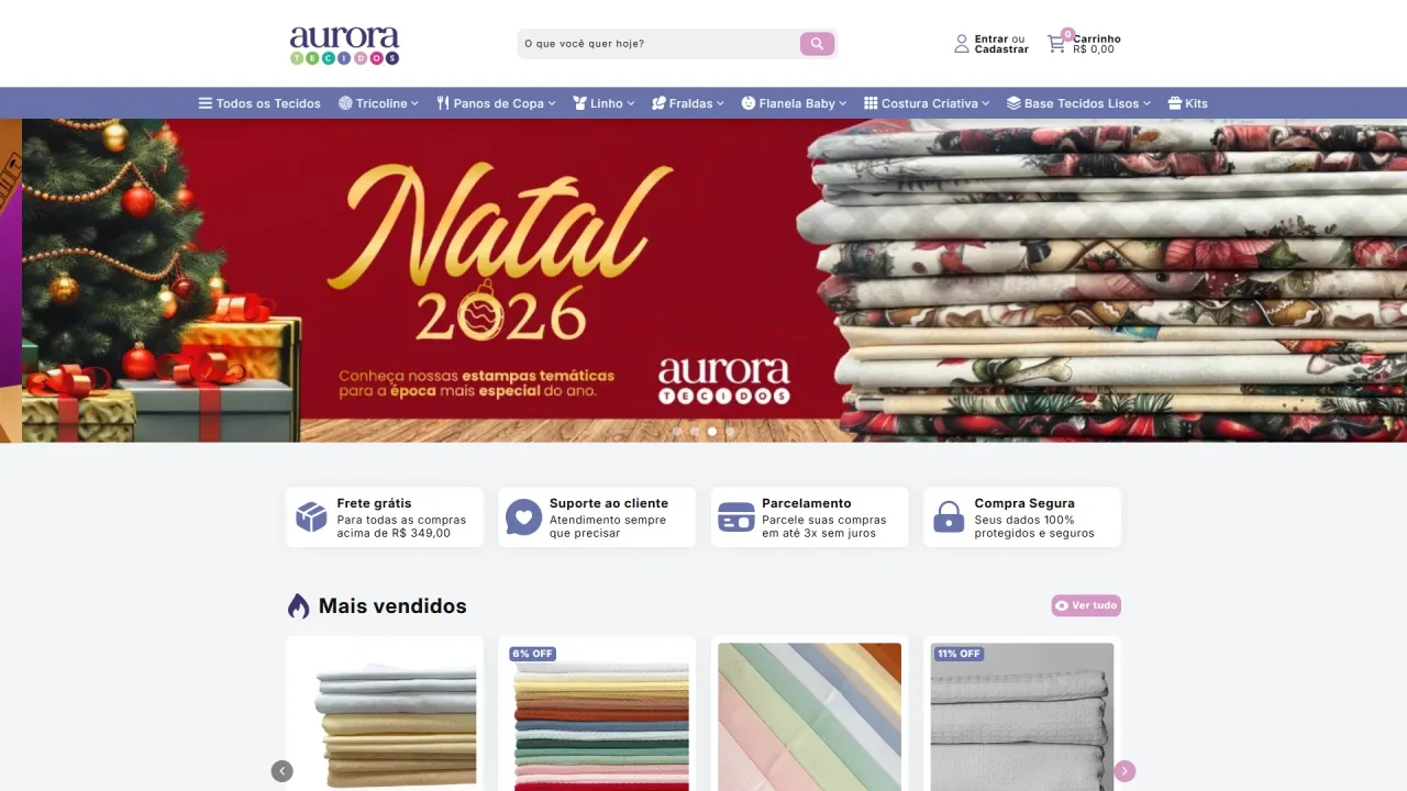
Homepage as a strategic showcase:
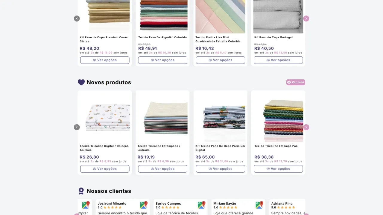
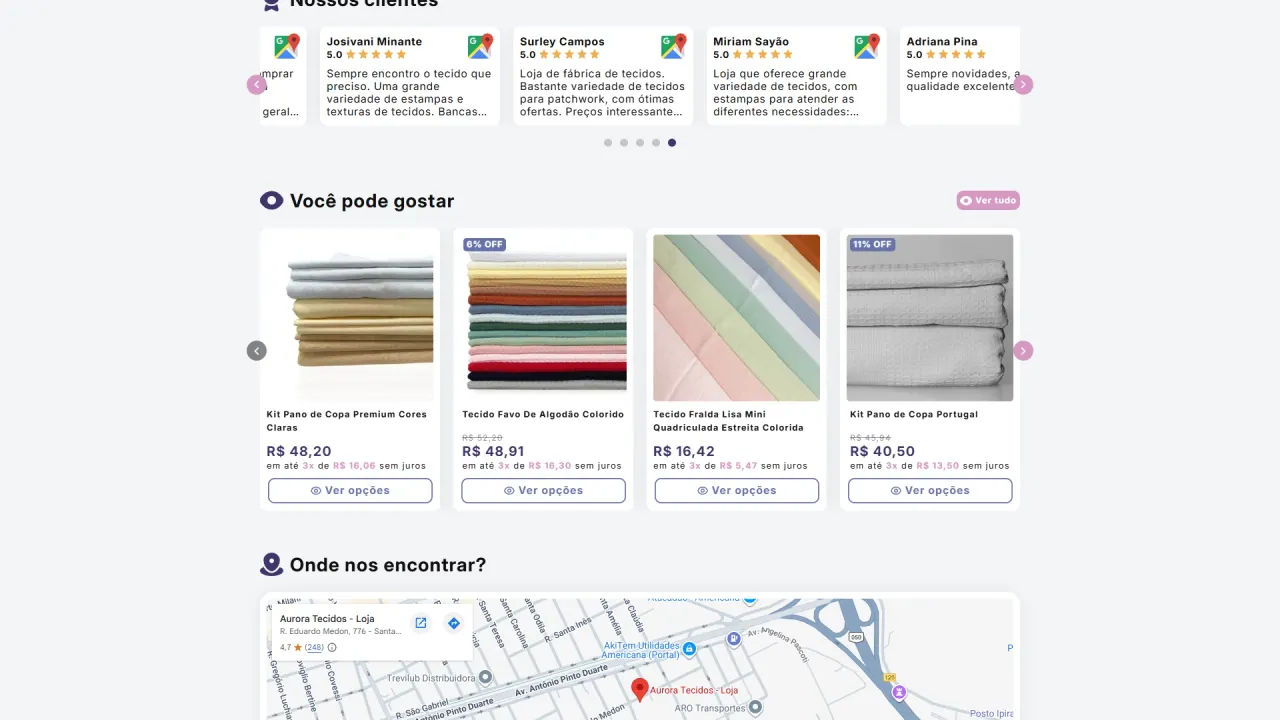
The homepage was designed to function as a digital showroom:
- High-impact slideshow
- Informational cards with objective icons
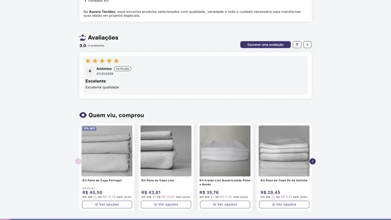
- Structured product grids (Best sellers, New arrivals, You may also like)
- Integrated social proof
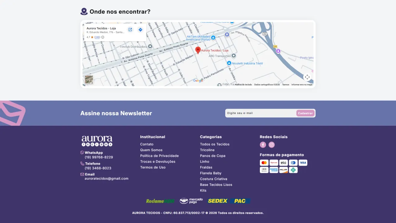
- Physical location block (map integration) to reinforce real-world presence
Each section follows a predictable visual rhythm, enhancing scanability.
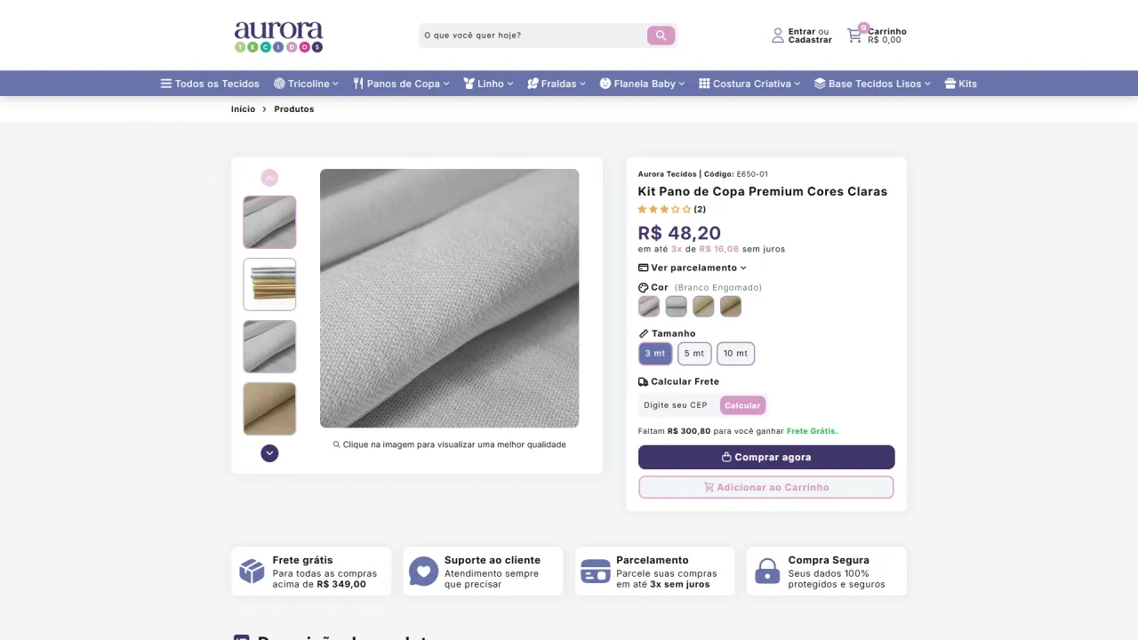
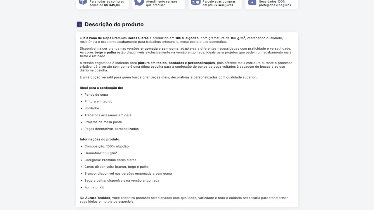
Product page oriented toward decision-making:
The product page was intentionally simplified.
Absolute priority was given to:
- Product title
- Enlarged price typography
- Installment visibility
- Clear primary CTA
Secondary information (shipping, technical details, etc.) was structured inside collapsible menus and controlled sections to avoid cognitive overload.
The focus was reducing friction and accelerating decision-making.
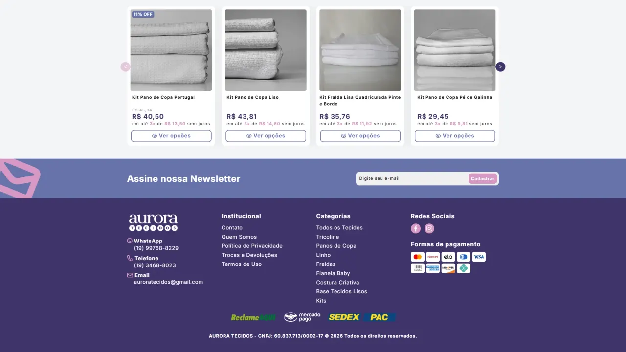
Functional header and footer:
- Direct category navigation
- Clear iconography
- Organized institutional information
- Clean and objective structure
Nothing ornamental. Everything functional.
What was implemented
Execution fidelity:
The implementation achieved approximately 98% fidelity to the approved Figma prototype, preserving:
- Typographic scale
- Spacing system
- Visual hierarchy
- Brand color palette
The UI was treated as a system, not as a suggestion.
ELOY V2 theme engineering on Dawn:
The UI was only the surface.
To support this experience, I used my proprietary theme ELOY, originally built on Shopify’s Dawn. For Aurora, the theme evolved into a fully restructured and optimized V2.
This was not a simple update. It was a technical reengineering.
Technical stack:
- Modular Liquid architecture with advanced variant logic
- Custom JavaScript interactions
- SEO-optimized semantic HTML
- Refined CSS3 with full responsive control
Key improvements in V2:
High-resolution zoom system:
- Enlarged view at maximum resolution
- Smooth modal that doesn’t break navigation
- Performance preserved
Image optimization:
- Intelligent compression
- Progressive loading
- Lower impact on Core Web Vitals
Smart variant system for fabrics:
- Visual swatches with real thumbnails
- Multi-pattern compatibility
- Intuitive length selection (50 cm / 1 m)
Frenet API shipping integration:
- Real-time shipping calculation through an intermediary API I developed
- Clean, non-invasive UI integration
Slide cart:
- No full-page redirects
- Instant updates
- Dynamic free-shipping incentive messaging
Integrated location map:
- Reinforced physical presence
- Local credibility
Performance and stability:
ELOY V2 was engineered for:
- Higher performance scoring
- Scalable architecture
- Reduced dependency on third-party scripts
- Long-term stability for future expansion
Result
Aurora Tecidos gained more than a new layout.
It gained:
- A coherent visual system
- A robust technical architecture
- A simplified user experience
- A scalable foundation for growth
UI and engineering worked as one unified system.
The result is a Shopify store that combines clarity, performance, and structural stability, built to grow without sacrificing user experience.