
Sensitive content (18+)
The following content is not intended for anyone under 18 or may be sensitive for some viewers.
Mundosado
Shopify e-commerce | Premium branding + Figma UI + custom theme (Dawn) | BDSM marketplace and sex shop
- Platform
- Shopify
- Period
- Jul to Sep 2025
- Stack
- Shopify
- HTML
- CSS
- JavaScript
- JSON
- Git
Overview
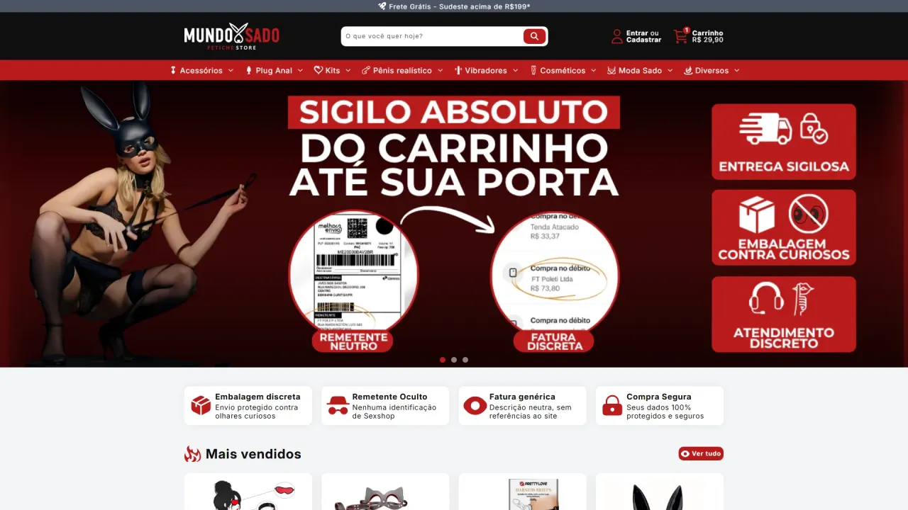
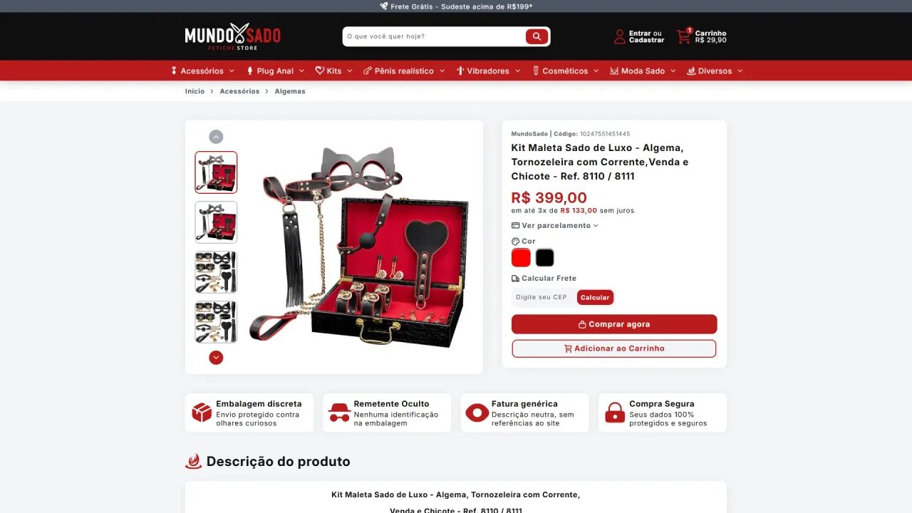
MundoSado was born from a strategic conversation with the client, who envisioned a high-end brand for the BDSM universe. The goal was to build an e-commerce experience with strong identity and a straightforward purchase flow, occupying a space where competitors still did not deliver a premium level of presentation.
Context and objective
The goal was not simply to list products online, but to build a brand with presence, clarity, and consistent visual standards, able to compete on perceived quality. Shopify was chosen as an operational and scaling decision, while the visual project and theme engineering would ensure differentiation, trust, and a smooth buying experience.
The challenge
This segment requires balancing visual impact and objectivity, because the journey must be fast, discreet, and trustworthy. We needed to translate references from the Brazilian sex shop landscape into something unique without feeling generic, keeping strict standards for spacing, margins, and readability. In addition, the implementation had to move beyond a “default theme” into a truly customizable theme, with logic, components, and content that supported a premium positioning, reinforcing privacy, discreet delivery, and purchase security.
The strategy
Build a premium storefront with clean, direct navigation, prioritizing hierarchy, scannability, and consistency across every page. The process started in Figma with competitor research and idea synthesis, turning references into a proprietary visual system. Next, the strategy was to convert that system into a highly editable theme, reinforcing trust elements through clear, repeatable communication, including the use of objective, standardized icons as a continuous visual language across the site.
What was implemented
Art direction and Figma UI:
- Research and references: analysis of competitors in Brazil’s sex shop market to map storefront patterns, credibility cues, and user journeys.
- Layout and visual system: creation of a clean, direct layout with consistent spacing, margins, and hierarchy to support faster decision-making.
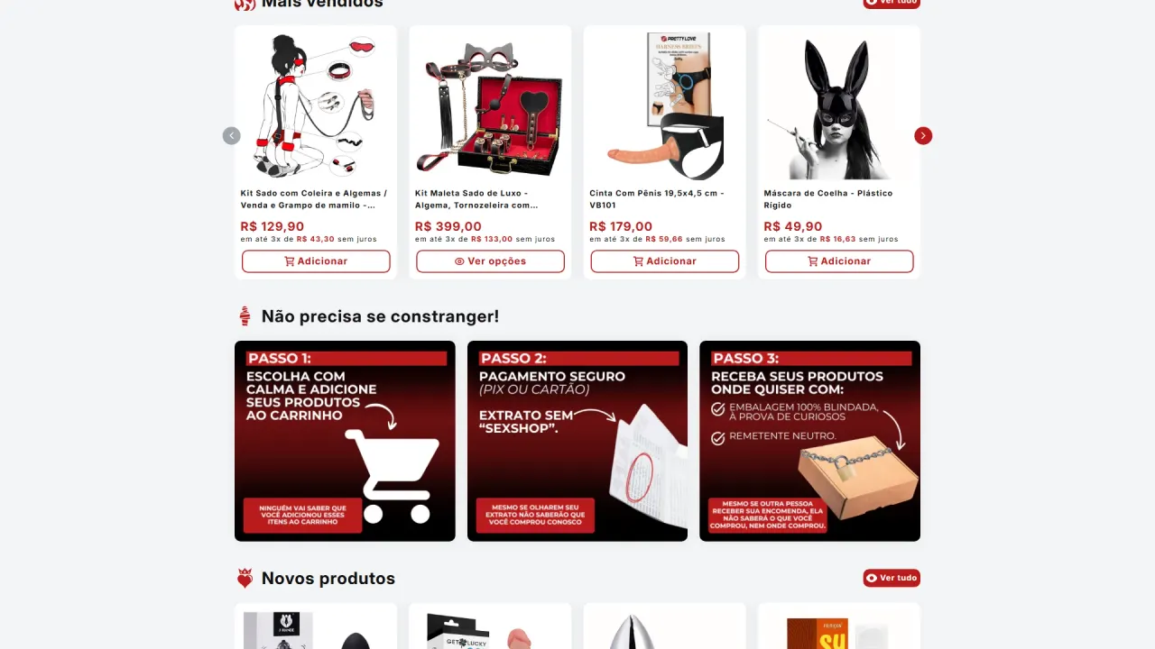
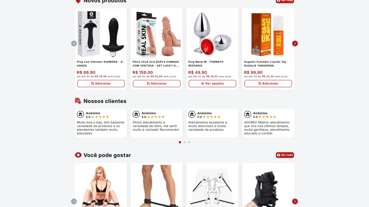
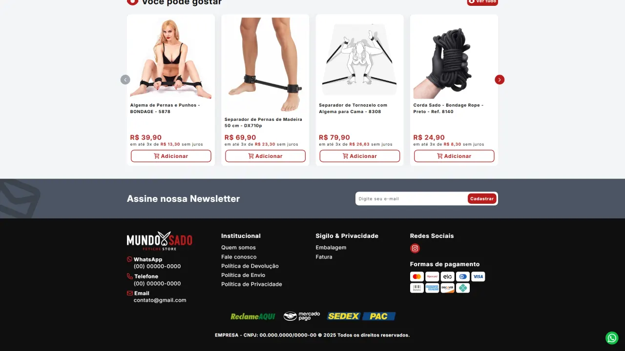
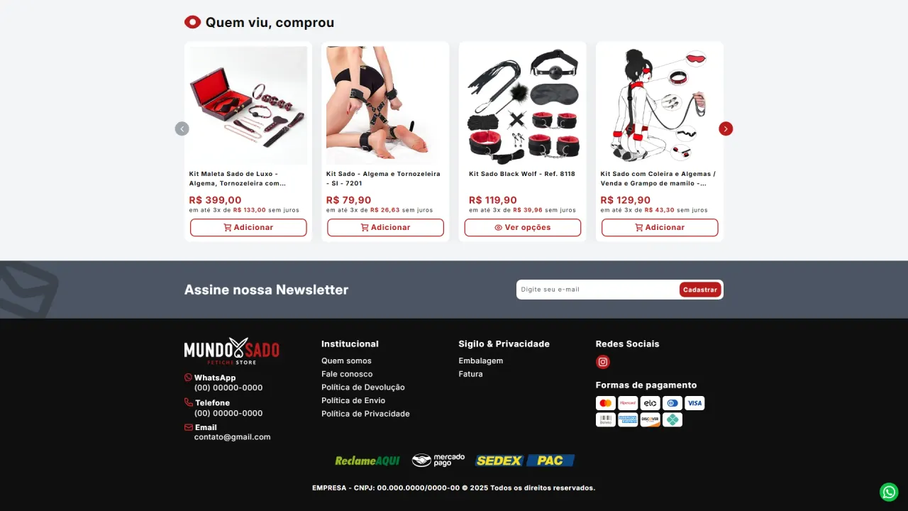
- Conversion-oriented storefront: design of sections to highlight best sellers, new arrivals, and recommendations, keeping fast readability and product focus.
Theme development and front-end engineering:
- Theme foundation: using Dawn as a base due to its robust structure and sections, serving as a starting point for a V1 theme and continuous evolution.
- HTML and CSS: structural changes to faithfully reproduce the Figma layout, refining composition, grids, spacing, and visual consistency.
- JavaScript: rewriting and adding scripts to improve interactions and component behavior, ensuring a smoother experience.
- Liquid and conditional logic: creating and refining rules to make the theme flexible, supporting different catalog and page scenarios.
Experience, trust, and visual consistency:
- Standardized, objective icons: implementation of a recurring icon system for benefits and security, improving scannability and reinforcing trust at key points in the journey.
- Privacy communication: strategic emphasis on messages such as discreet delivery, packaging that keeps prying eyes out, neutral sender, and discreet invoice, reducing friction and increasing user comfort.
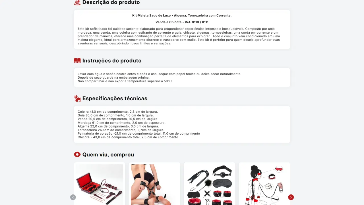
- Structured product page: organization of content into clear blocks, including description, instructions, and technical specifications, improving readability and purchase decisions.
- Consistent identity: strong application of a dark palette with red accents, creating premium presence and guiding attention to actions and key information.
Organic SEO and technical content:
- SEO structure: organization of meta descriptions and essential elements to improve search-engine interpretation.
- Image optimization: standardization and improvement of related attributes and text, focusing on keywords and discoverability.
- Foundation for evolution: planning the theme to support continuous performance and metrics improvements in future versions.
Result
The project reached a stable V1 theme in about 45 days and was launched after alignment with the client, delivering a premium storefront with strong identity and a direct purchase journey. The experience became more trustworthy and comfortable, with clear privacy messaging and a standardized icon system that reinforces benefits throughout the site. In 2026, the project was paused due to the client’s personal reasons, which prevented ongoing optimization and metric improvements, but the foundation remains solid and ready to evolve.