
Pratesia
Shopify e-commerce | Custom layout | Silver accessories store
- Platform
- Shopify
- Period
- Oct 2025
- Stack
- Shopify
- HTML
- CSS
Context and objective
The client was already selling silver accessories on social media and wanted to expand sales with a more robust digital presence. The goal was to translate the elegance and shine of silver into an online store layout that was sophisticated, delicate, and inviting all at once to new customers.
The challenge
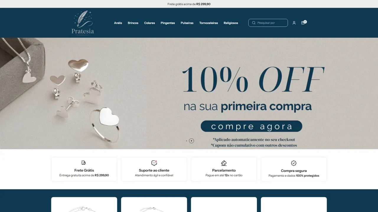
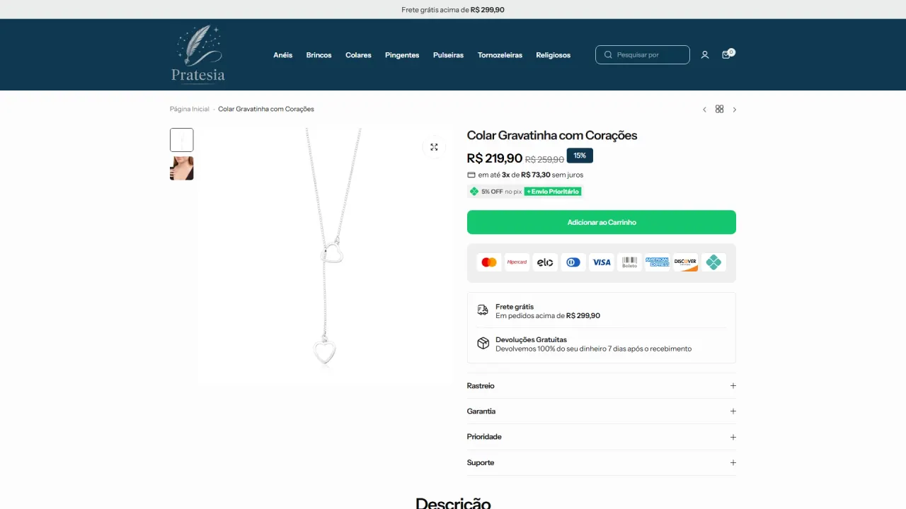
The brand's logo has an unconventional shape, which made it difficult to apply it to a white header. It was also necessary to balance several light colors from the original palette to maintain readability and modernity, without sacrificing the refined aspect that a jewelry brand requires.
What was implemented
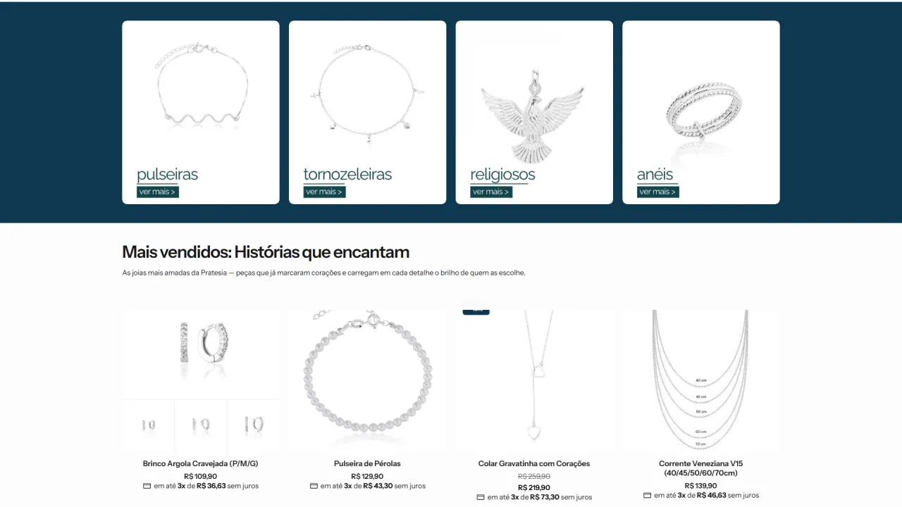
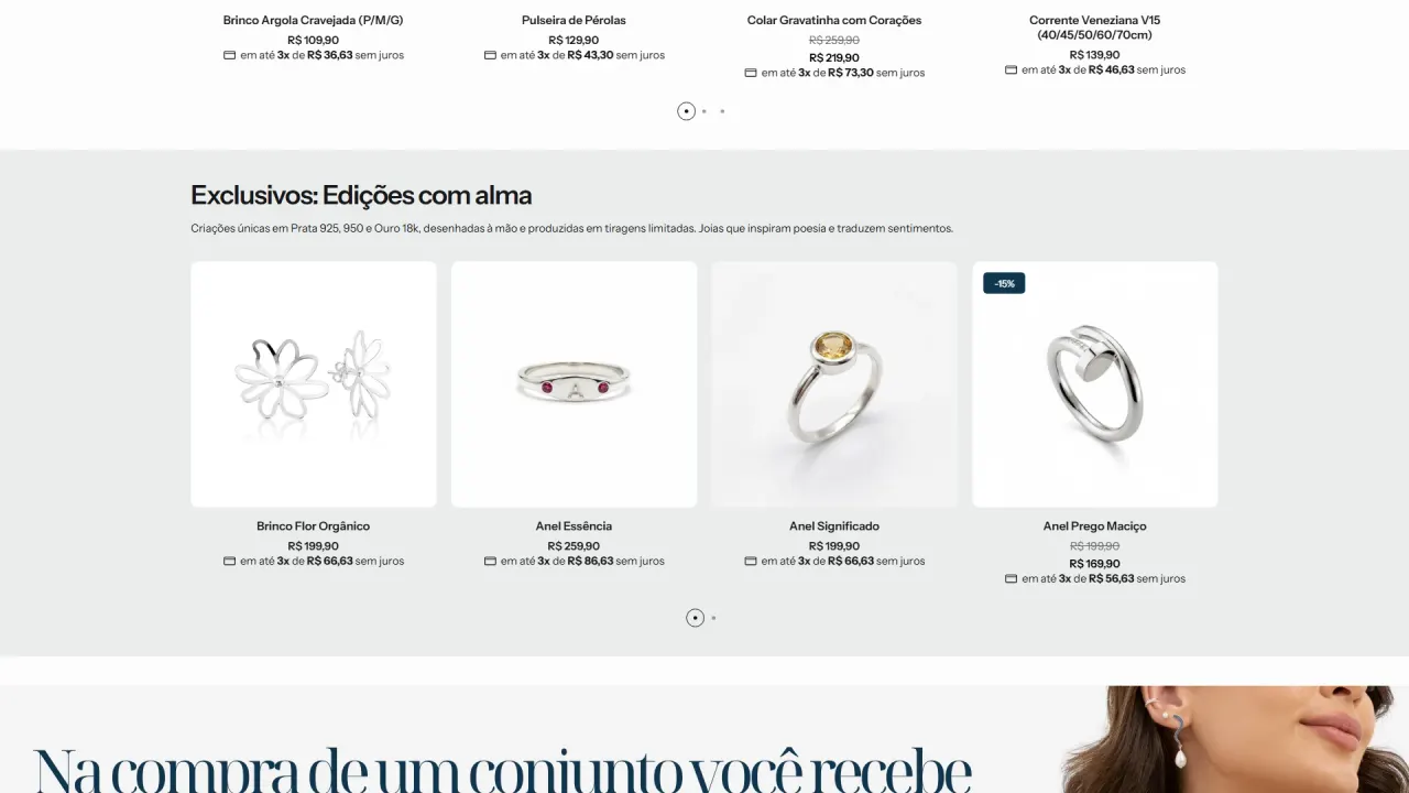
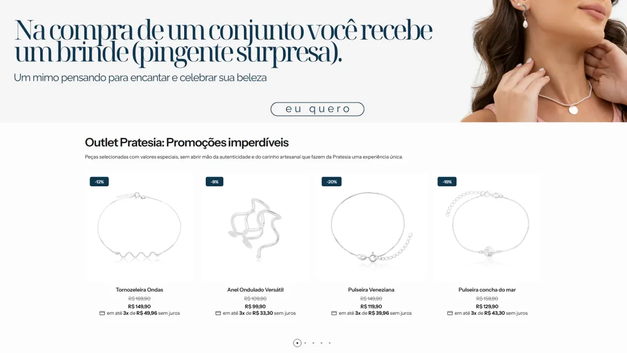
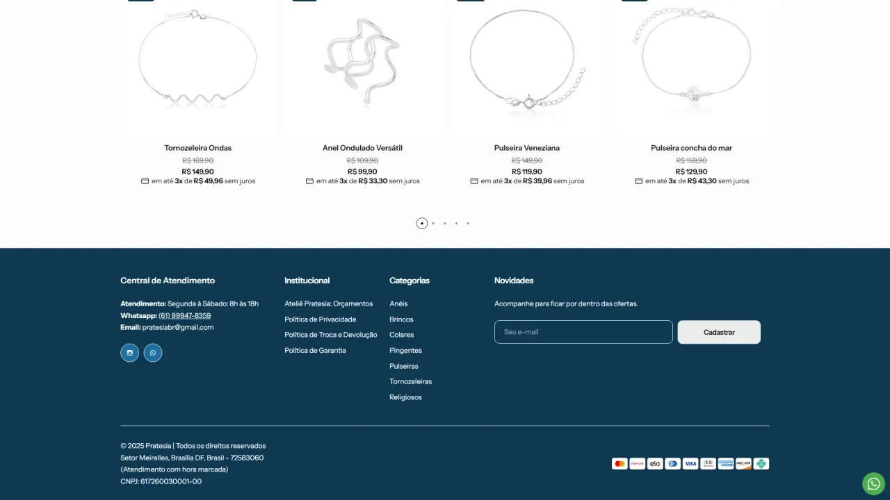
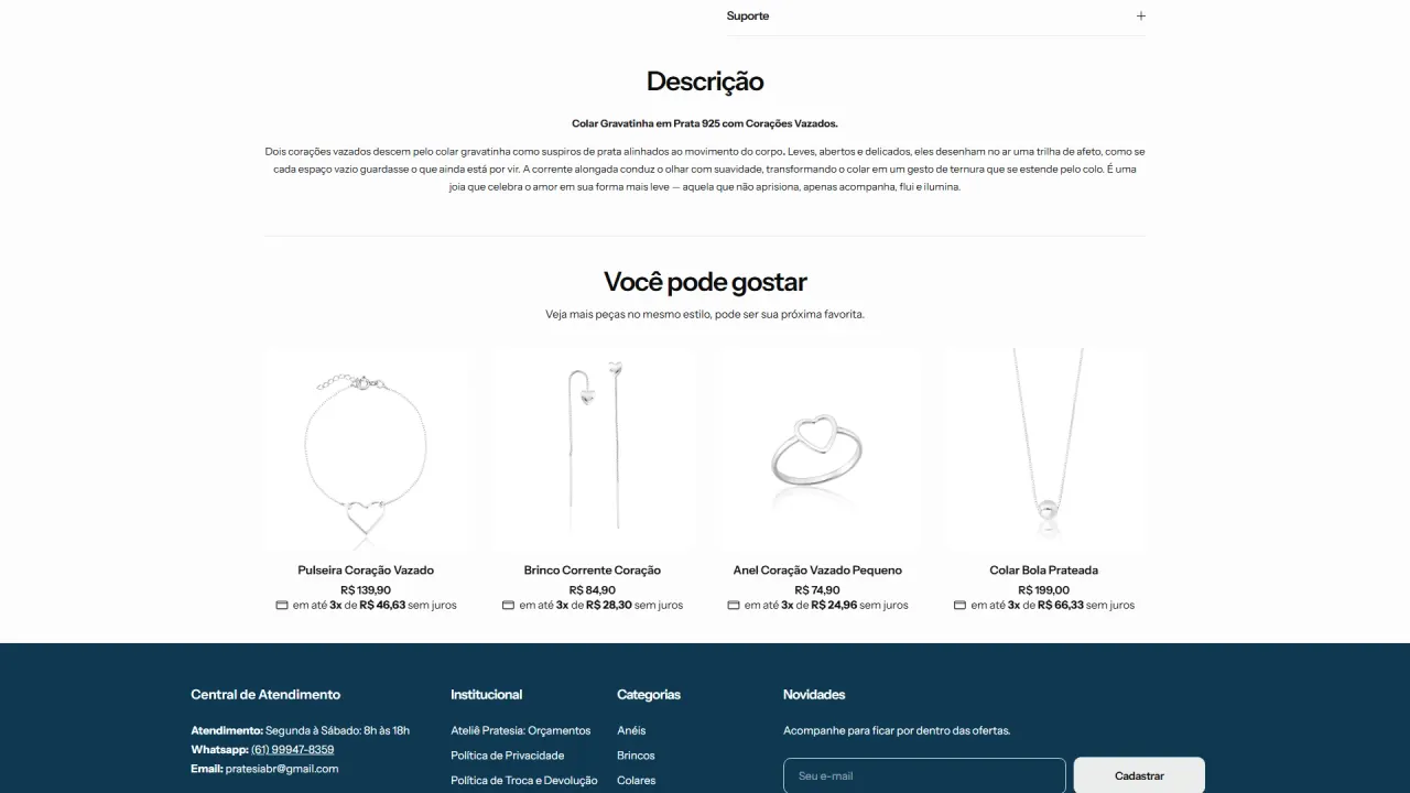
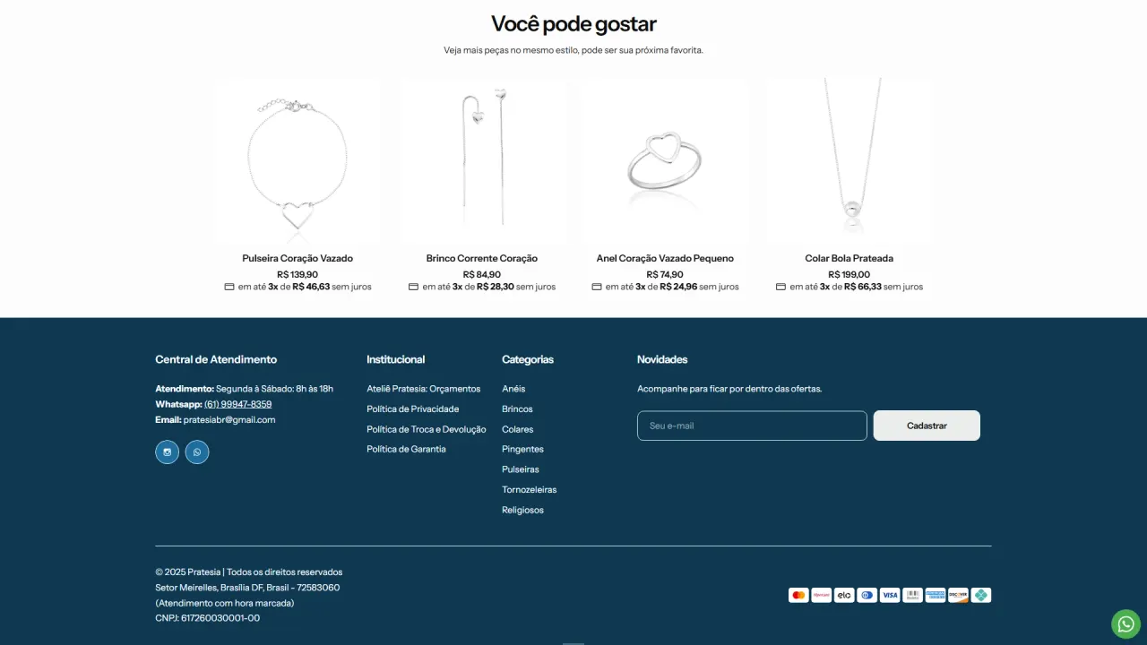
I developed the layout on Shopify seeking modernity and sophistication, using rounded borders and a color composition designed to enhance the logo. I adjusted the header to use the brand's main color, creating contrast and highlighting the visual identity. The chosen palette, with silver, navy blue, and white, was applied consistently throughout the store, harmonizing with the products and reinforcing the refined accessory concept.
Result
The resulting layout was well organized and conveyed a sense of light luxury, with harmony between the shine of silver and the tones of blue and white. The change in the header enhanced the logo and gave a sophisticated air to the whole, contributing to a purchase experience more consistent with the quality of the products offered.