
Farmácia Farmarela
GreatPages landing page | Art direction + conversion design | Farmarela licensing
- Platform
- GreatPages
- Period
- Jan to Feb 2026
- Stack
- GreatPages
- Photoshop
- Illustrator
Overview
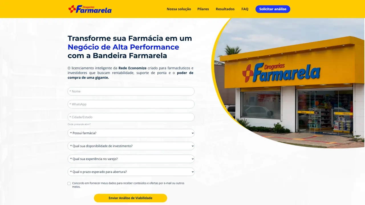
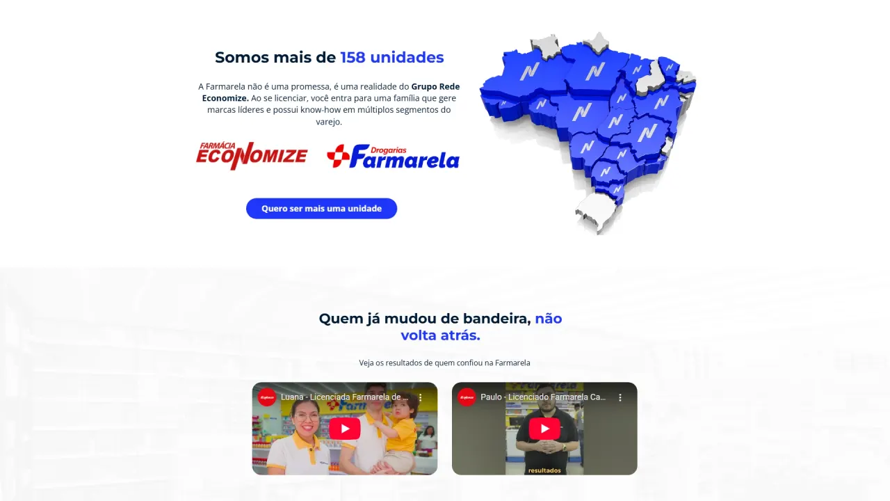
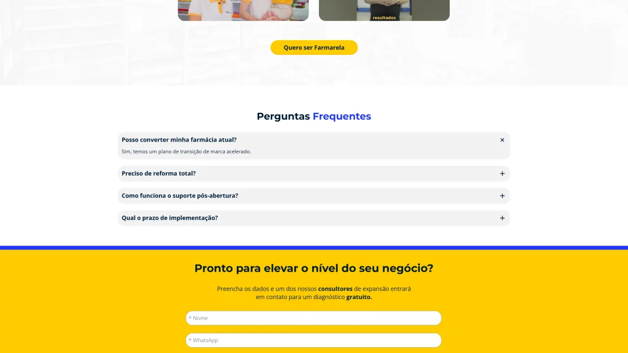
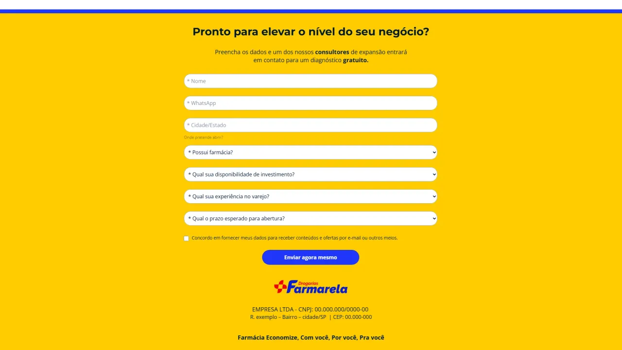
Farmarela’s landing page was created for expansion campaigns focused on selling licenses, with the goal of turning traffic into qualified leads consistently. The project focused on building a page with strong institutional presence, high offer clarity, and a premium visual experience that supports trust and contact intent.
Context and objective
The project came from a B2B partnership operation, where there was a need for landing pages ready for acquisition campaigns. Once the scope was agreed, I was responsible for the full visual creation of the page in GreatPages, ensuring a clear conversion narrative aligned with the licensing model pillars and with an aesthetic consistent with Farmarela’s identity.
The challenge
A high-conversion landing page requires balance between impact and readability, especially for an offer that involves investment, where credibility and clarity matter a lot. The challenge was to create a visually strong page without tiring the user, organize the sections with solid hierarchy, and elevate image quality to maintain a premium standard. In addition, we needed original graphic elements to differentiate the page from generic layouts and reinforce brand presence.
The strategy
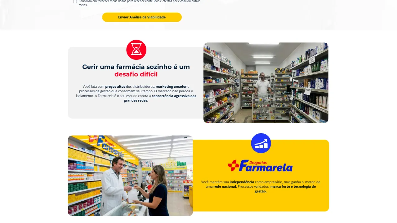
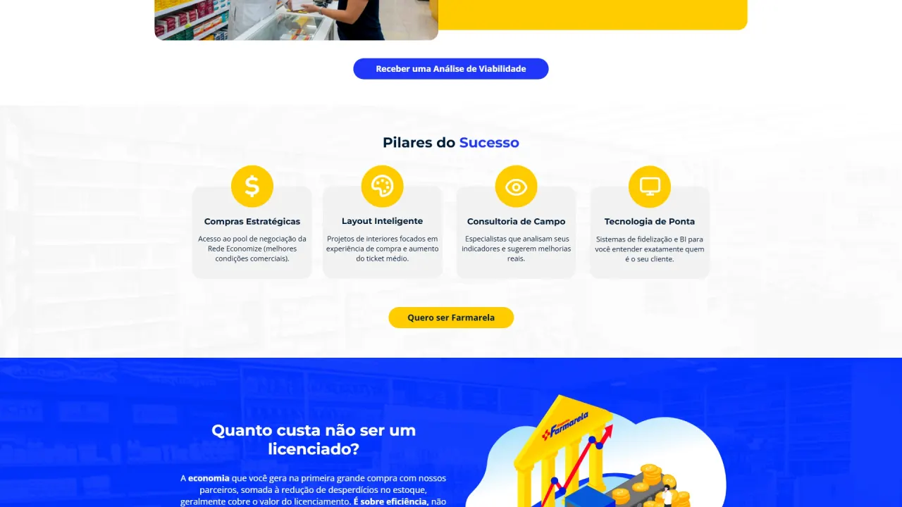
Build a section-by-section narrative that guides the user smoothly, combining authority blocks, pillars, social proof, and recurring CTAs. Visually, I used Farmarela’s main colors as highlights and white backgrounds to keep breathing space and visual comfort. The strategy also included improving visual assets with AI and professional finishing, plus adding custom vectors and icons to increase brand perception and consistency.
What was implemented
Visual direction and page composition:
- LP creation in GreatPages: structuring sections, content hierarchy, and strategic CTA placement to guide the user to the form.
- Palette and identity: using the brand’s key colors as highlights and light backgrounds to increase readability and reduce visual fatigue.
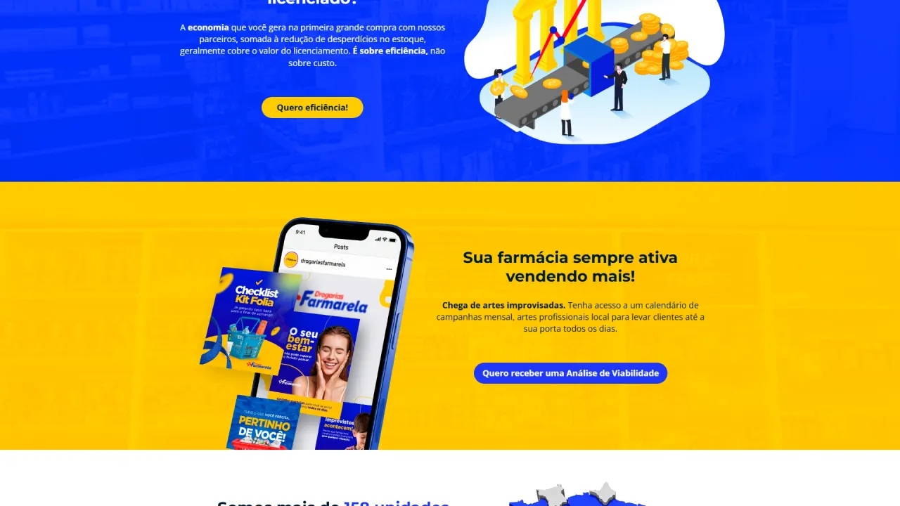
- Modern mockups: creating mobile mockups with a contemporary look and depth feel to showcase materials and campaign content.
Images, quality, and premium finishing:
- AI enhancement: creating and improving images using Gemini with Nano Banana Pro to boost sharpness, lighting, and realism.
- Professional final retouch: finishing and corrections in Photoshop to ensure consistent color, contrast, and visual polish.
Icons, vectors, and original elements:
- Vector work in Illustrator: creating and vectorizing sections with drawings and branded graphic elements, raising the overall professional feel.
- Icons and readability reinforcement: applying icons to improve scannability, separate topics, and reinforce fast understanding of the pillars.
Result
The result was a landing page with strong institutional aesthetics, clean visuals, and a well-guided conversion narrative. The combination of light backgrounds with highlighted brand colors delivered comfort and brand presence, while enhanced images and original vectors elevated the premium perception. The LP was delivered ready for campaigns with a more professional presentation, reinforcing trust and increasing the potential to generate qualified leads.