



ALLPRO
Yampi e-commerce | Visual direction + layout setup | Gamer and geek universe
- Platform
- Yampi
- Period
- Feb 2026
- Stack
- Yampi
- CSS
Overview
ALLPRO was an e-commerce project built on the Yampi platform, focused on creating a modern, organized and commercial experience for a gamer and geek catalog. My responsibility was to structure the store’s layout and visual presentation, ensuring a strong showcase on the home page and a clear, scannable product page ready to convert.
Context and objective
The goal was to deliver a store with a striking identity that was still easy to navigate, for a catalog of visual products such as Funko Pop, accessories and peripherals. The approach was to build a home page that worked as a showcase for promotions and categories, while the product page kept a simple hierarchy to speed up the purchase decision.
The challenge
The main challenge was balancing a strong look, with intense colors and a gamer atmosphere, without losing readability. It was also necessary to organize multiple showcase, promotion and social proof sections without turning the home page into a cluttered block. On the product page, the priority was keeping the price, the call to action and the essential information clear, easy to scan on both desktop and mobile.
The strategy
The strategy was to apply a consistent visual system based on contrast and repeated components. The home page was structured with a strong promotional hero, followed by category shortcuts and carousel showcases, creating rhythm and keeping users browsing. The layout also prioritized trust elements such as purchase benefits, reviews and sign-up areas, reinforcing credibility throughout the journey.
What was implemented
Home page as a commercial showcase:
- Promotional hero: main banner with a first-purchase offer and a prominent CTA, creating immediate impact and directing action.
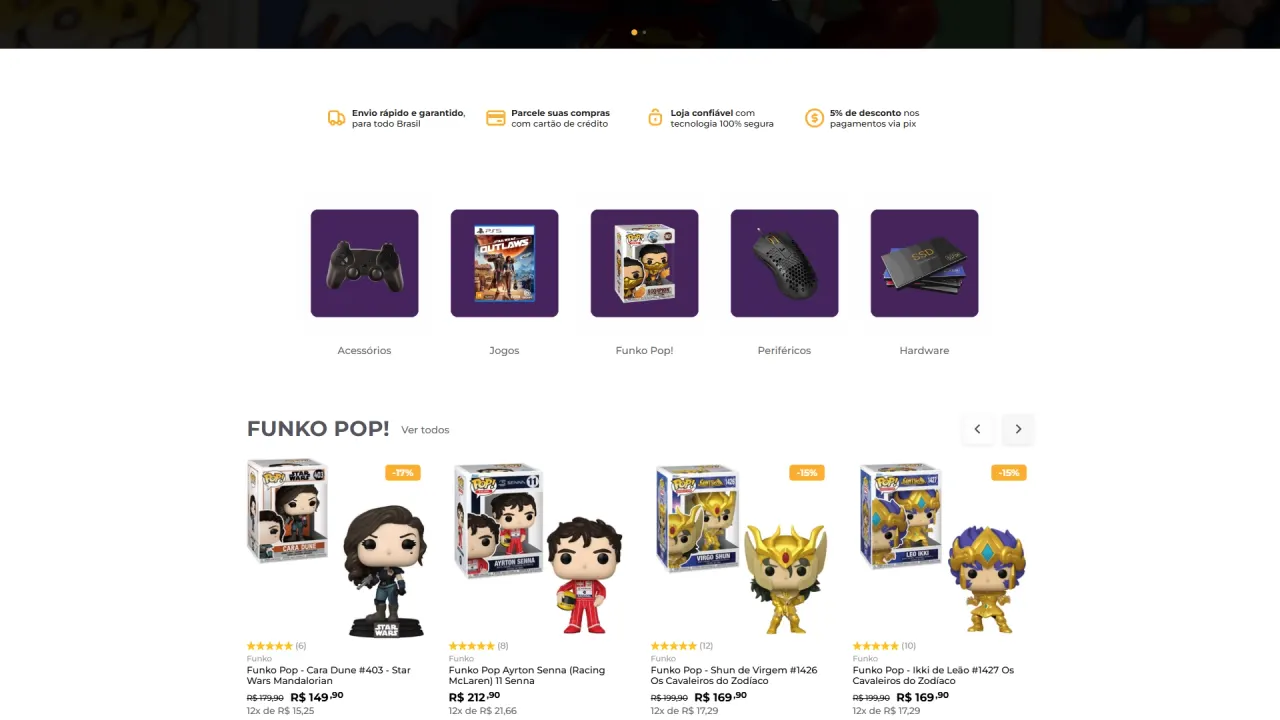
- Category shortcuts: cards with icons for quick access to categories such as accessories, games, Funko Pop, peripherals and hardware.
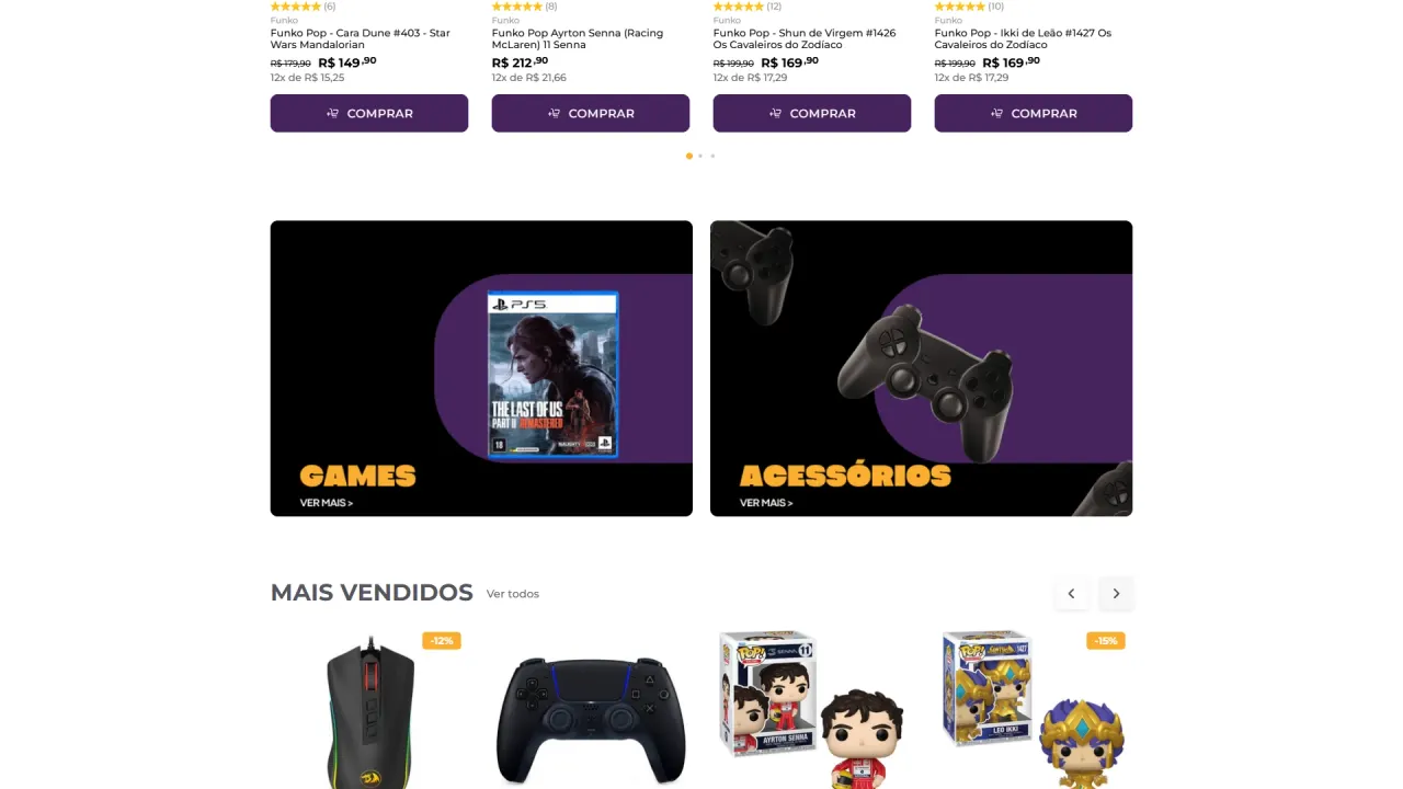
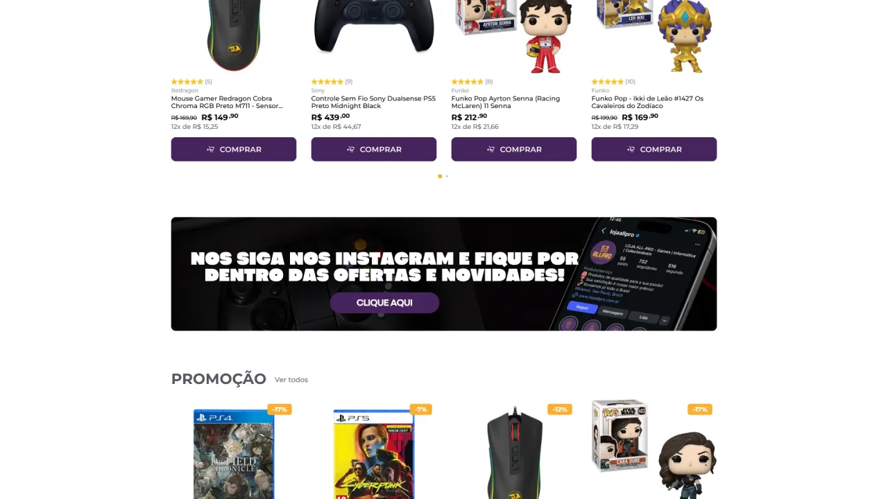
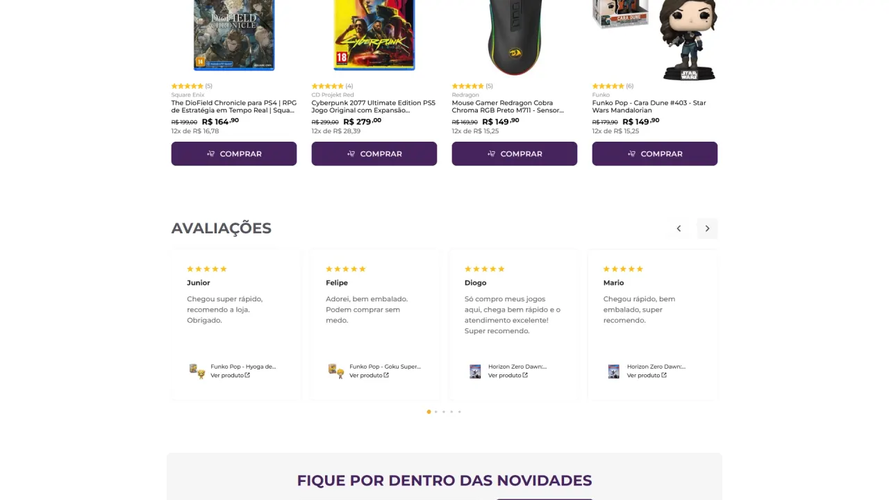
- Intent-based showcases: sections such as “Best sellers” and “Sale” in carousel format to increase discovery and make comparison easier.
- Featured banners: horizontal blocks to reinforce categories and campaigns, keeping the visual rhythm throughout the home page.
Visual identity and consistency:
- High-contrast palette: purple base with orange details to reinforce the gamer universe, with highly visible CTAs.
- Typography and hierarchy: large headings and direct reading, with buttons and prices highlighted for quick decisions.
- Standardized components: repeated product cards and buttons to create predictability and improve scannability.
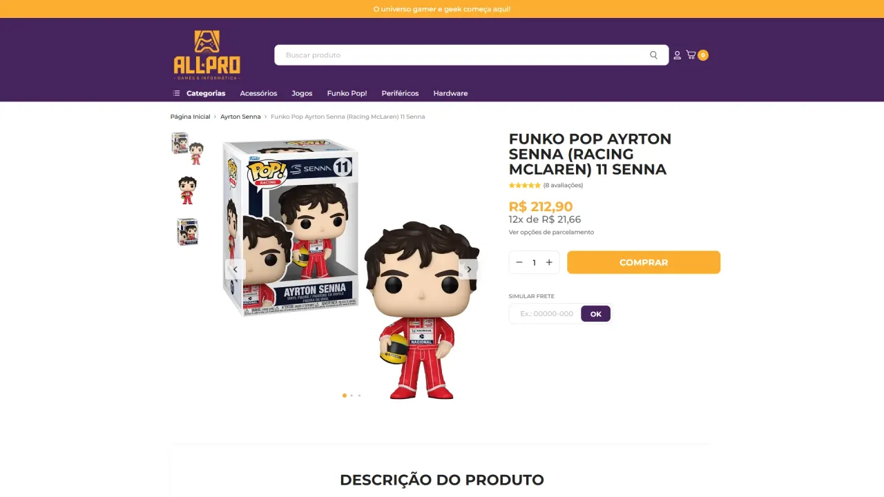
Conversion-oriented product page:
- Clear gallery: images with side thumbnails for a quick view of the product.
- Objective purchase area: highlighted price, quantity selection and a main CTA that reads at a glance.
- Accessible shipping calculator: postal code field placed in plain sight, without competing with the CTA.
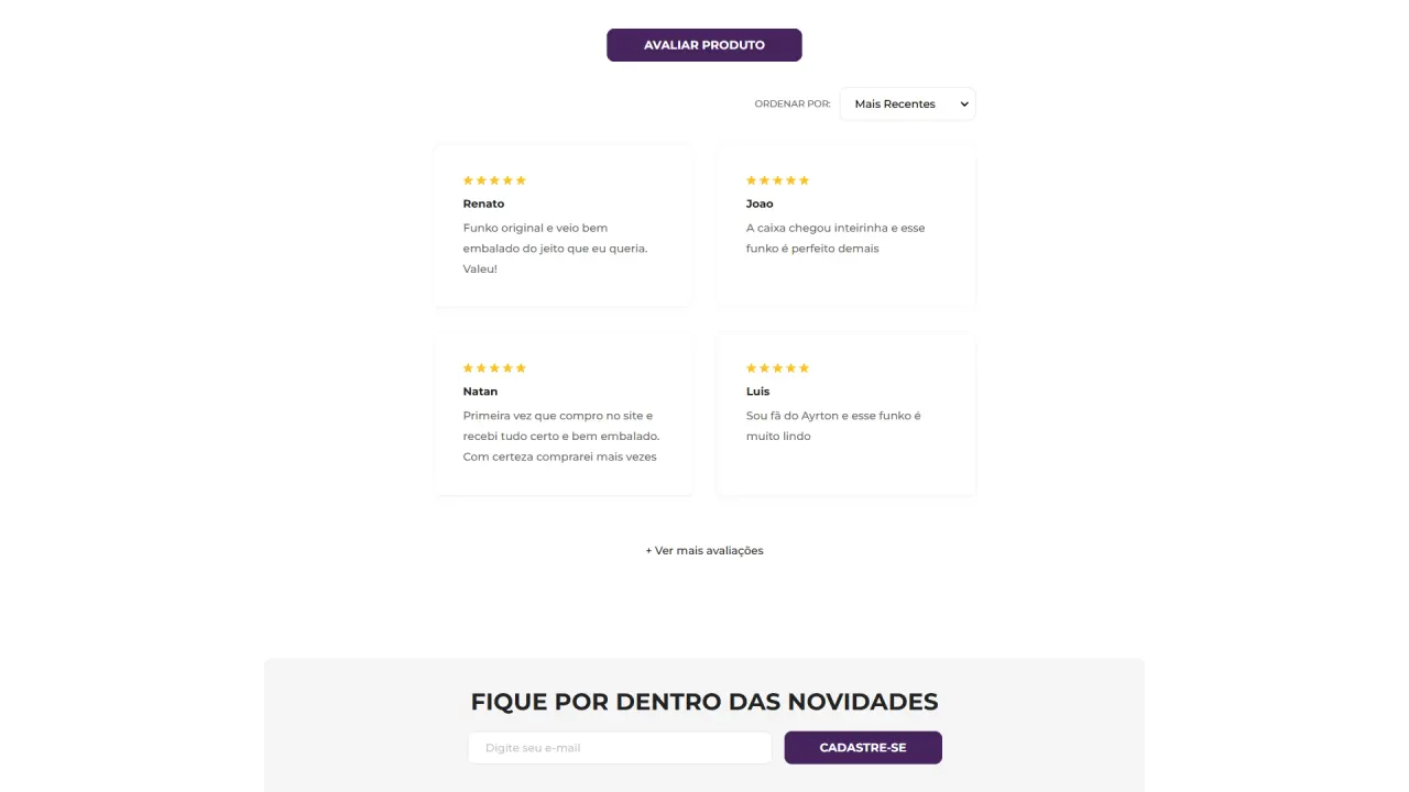
- Organized content: product description, technical specifications and reviews structured in blocks for easy reading.
Trust and retention:
- Reviews block: a dedicated section to reinforce social proof and reduce objections.
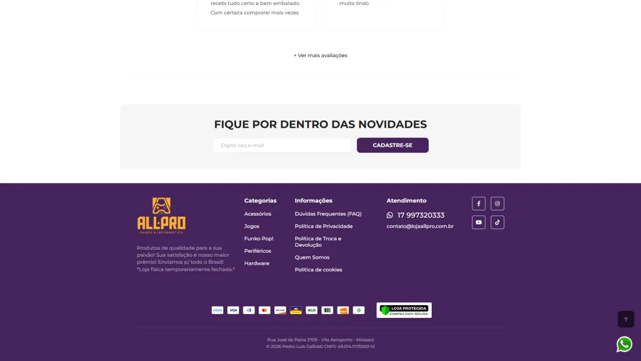
- Newsletter: a sign-up area to capture leads and keep the relationship with the audience.
- Complete footer: structure with institutional information, policies, customer service and security seals to reinforce credibility.
Result
The result was a Yampi store with a striking look and simple navigation, ready to sell within the gamer and geek universe. The home page works as a commercial showcase with well-organized campaigns and categories, while the product page stays focused on conversion with a clear hierarchy, scannable content and trust elements spread across the journey.