
Rede Economize
GreatPages landing page | Art direction + conversion design | Rede Economize licensing (two models)
- Platform
- GreatPages
- Period
- Jan to Feb 2026
- Stack
- GreatPages
- Photoshop
- Illustrator
Overview
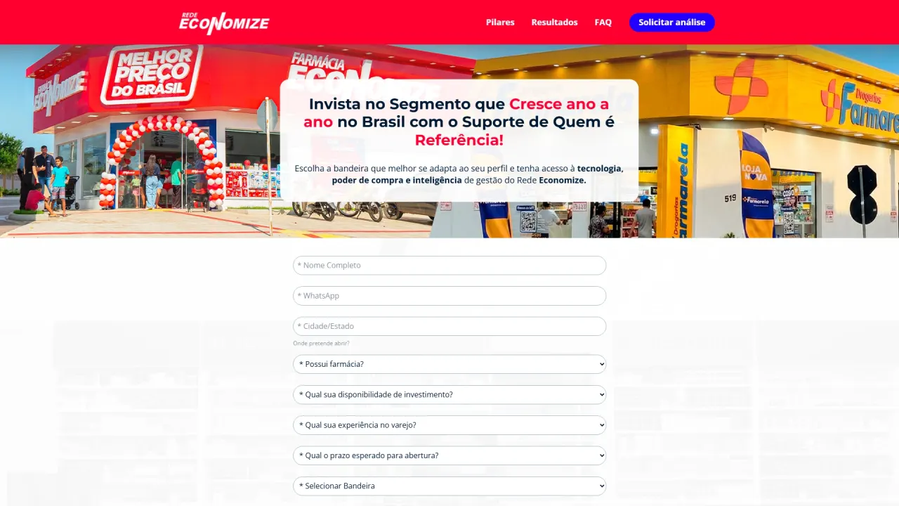
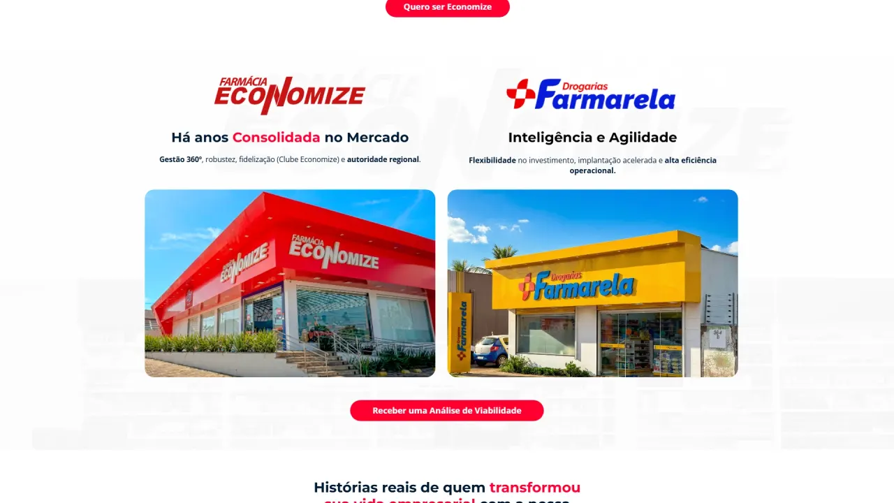
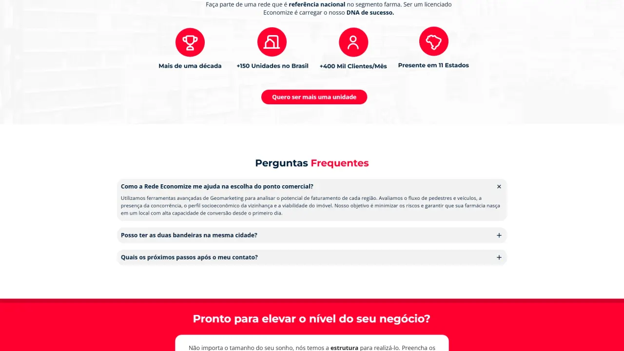
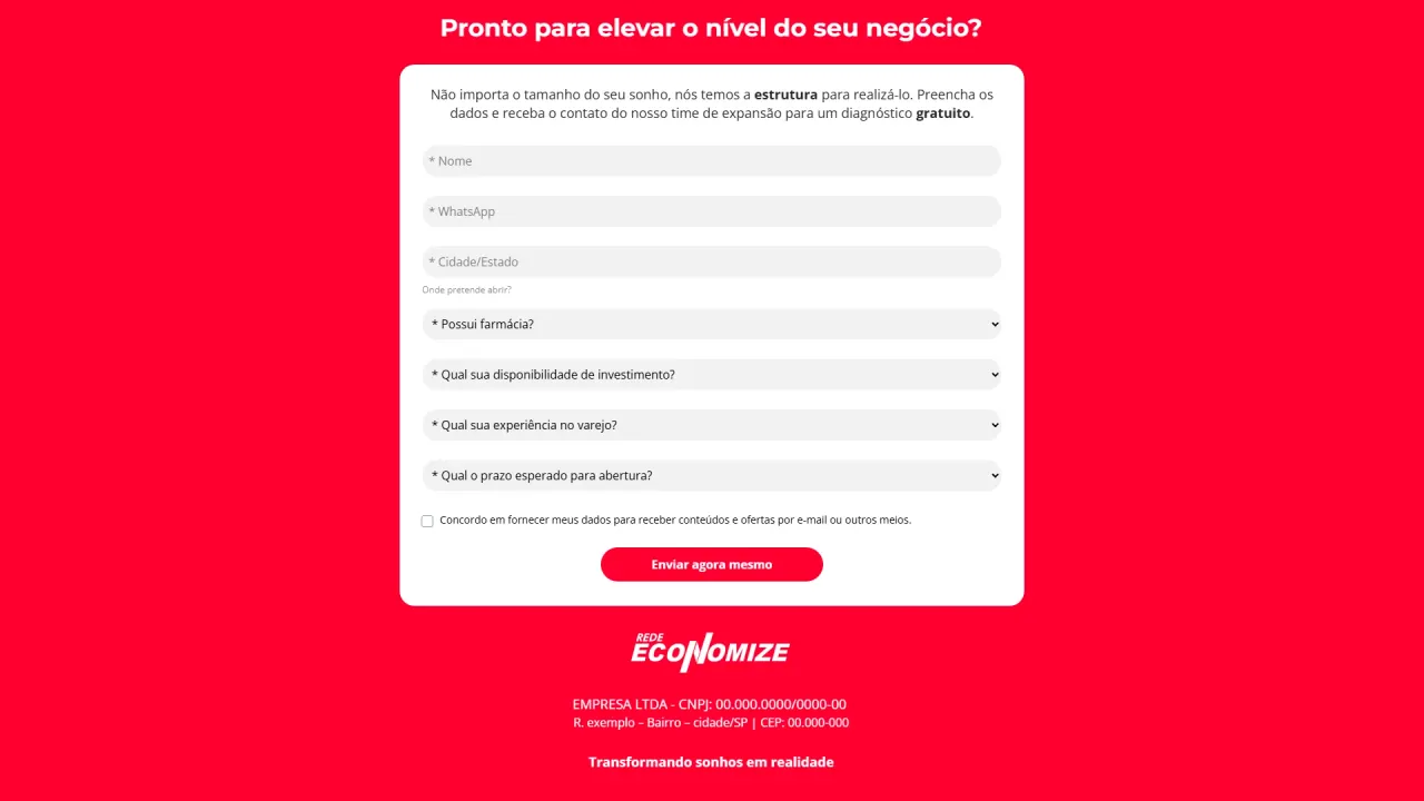
Rede Economize’s landing page was created for expansion campaigns with an additional strategic goal: presenting the operation’s two licensing models in a clear and convincing way. The project focused on turning traffic into qualified leads, guiding the user to quickly understand the differences between an efficient model and an efficient model with premium positioning.
Context and objective
This is the third LP delivered within the same expansion operation, maintaining visual and narrative consistency across the pages. The key difference in this LP is its comparative role: beyond capturing leads, it needs to help users choose the best model without creating confusion, preserving the network’s institutional strength and keeping both paths as valid options.
The challenge
When there are two offers, the biggest risk is losing conversions due to uncertainty. The challenge was to structure the page to educate users quickly without adding friction, making the differences between models obvious and easy to compare. At the same time, it was essential to maintain premium aesthetics, comfortable readability, strong hierarchy, and visual assets at the same high standard as the other LPs in the operation.
The strategy
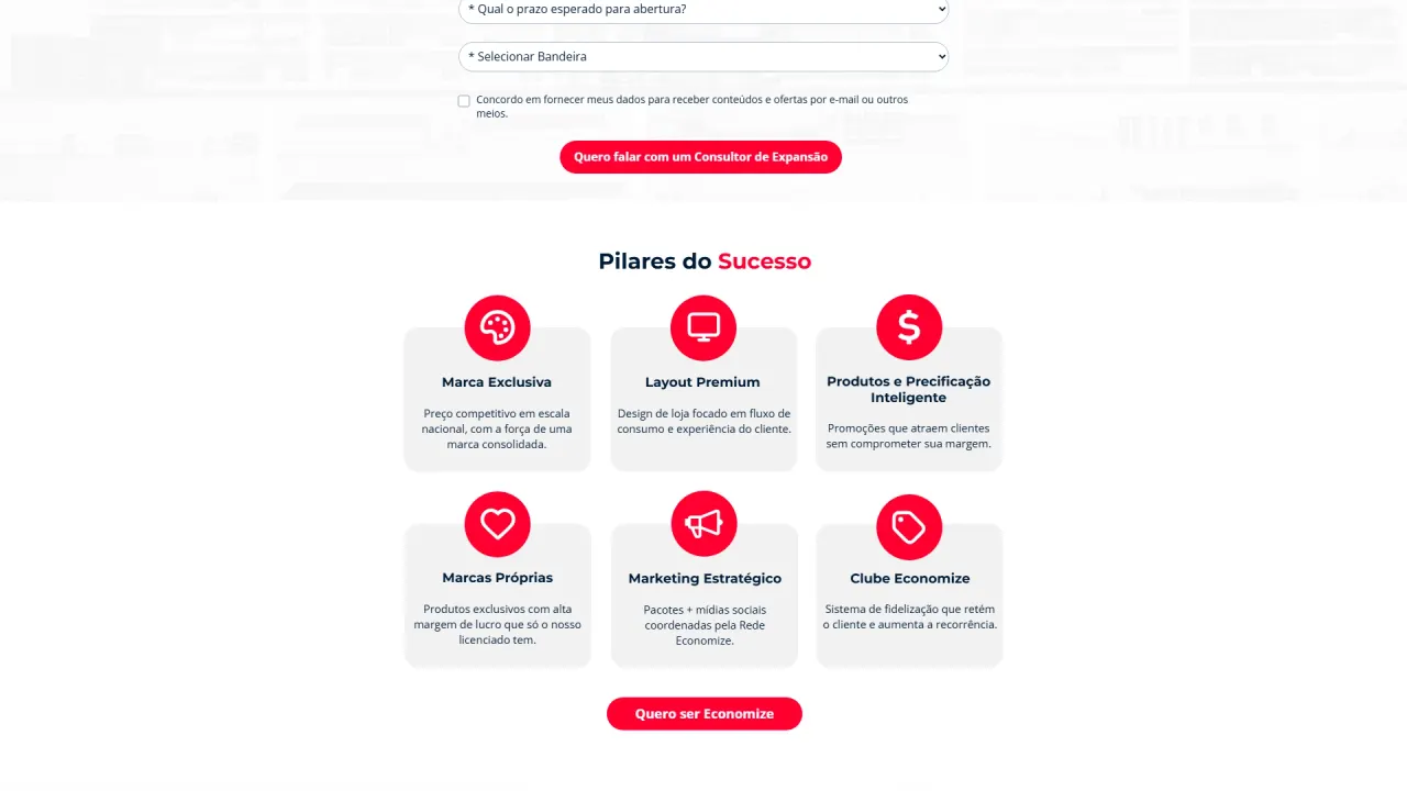
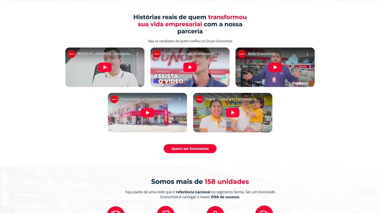
Build a section-based narrative that starts with promise and authority, then leads into a clear comparison block between the two models. The strategy relied on consistent visual language, recurring CTAs, and scan-friendly blocks, using color highlights and iconography to guide understanding and decision-making. The design kept light backgrounds for comfort and institutional colors as focus points, reinforcing credibility without tiring the user.
What was implemented
Visual direction and page composition:
- LP creation in GreatPages: structuring sections, hierarchy, and CTA placement to keep the conversion flow from start to finish.
- Model comparison section: visual organization to present both licensing formats clearly, highlighting differences without devaluing either option.
- Palette and identity: applying institutional colors as highlights and light backgrounds to increase readability and maintain visual rhythm.
Images, quality, and premium finishing:
- AI enhancement: creating and improving images using Gemini with Nano Banana Pro to boost sharpness, lighting, and realism.
- Professional final retouch: finishing and corrections in Photoshop to ensure consistent color, contrast, and polish.
- Modern mockups: creating mobile mockups with a contemporary look and depth feel to reinforce materials and digital presence.
Icons, vectors, and readability reinforcement:
- Vector work in Illustrator: creating and vectorizing sections and graphic elements with brand presence, increasing perceived professionalism.
- Iconography for comparison: using icons to separate benefits, organize information, and speed up understanding of differences between models.
- Scan-friendly blocks: structuring content in cards and objective sections to reduce friction and increase retention.
Result
The result was a strong institutional landing page aligned with the other LPs in the operation, with a clear differentiator: the ability to present two licensing models in an objective and persuasive way. The page guides users with more clarity, reduces indecision, and keeps focus on conversion, reinforcing credibility and increasing the potential to generate qualified leads across both investment profiles.